Hi, would it be possible to have an option for radio buttons to be formatted to appear horizontally on the form instead of vertically?
Would be a good addition to help save space on a form.
kind regards,
Dean
Horizontal Radio Buttons
Hi Dean,
this could be an interesting option to set by default.
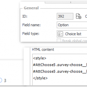
For the moment one can achieve the same with some css styling using an html field. This works with 2022.1.3.65.
Best regards,
Daniel
<style>
#AttChoose5 .survey-choose__list--radio {display:block;}
#AttChoose5 .survey-choose__list__item {margin-right:10px}
</style>
I have the following snippet saved as a global business rule. It also hides the letters before the radio buttons.
<style>
.dynamic-form.modern .survey-choose__list--numeric {
list-style-type: decimal;
margin-left: 6px;
margin-right: 6px;
}
.dynamic-form.modern .survey-choose__list {
display: flex;
margin-left: 4px;
/*flex-direction: row;
justify-content: space-between;*/
}
.dynamic-form.modern .survey-choose__list__item__text--key {
display: none;
}
</style>


