Just a reminder ;-) : https://community.webcon.com/forum/thread/1028?messageid=1028
Hello there,
with working much more with compact start buttons, i am optimizing our older dashboard layouts.
We have a few applications, which have many start buttons.
So i was wondering, if, maybe, in further coming WEBCON versions there could be the possibility to
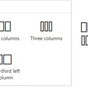
add 2 more "section layouts" like i posted in the picture. Mostly the usefull one would be: half side left,
and two small columns in the right half.
With this layout options designing dashboards and grouping buttons would work much better.
Thanks,
Bjoern
P.S.: Maybe i forgot the third version 25% - 50% - 25%, if someone want to place a central image.
SUGGESTION: NEW LAYOUT OPTION FOR DASHBOARD [50%-25%-25%] DONE
Hi Bjorn,
I think what's coming is even better than your original ask :). We're going to introduce the ability to design dashboards using a grid. So you'll have much more freedom with the look & feel of your dashboards.
You should expect this to happen in the next WEBCON version.
Hi Bjorn,
I think what's coming is even better than your original ask :). We're going to introduce the ability to design dashboards using a grid. So you'll have much more freedom with the look & feel of your dashboards.
You should expect this to happen in the next WEBCON version.
Now I’m really curious.
Maybe there will be a preview at WEBCON DAY ;-) ?
Our team is already looking forward to it!
Now I’m really curious.
Maybe there will be a preview at WEBCON DAY ;-) ?
Our team is already looking forward to it!
Since we've allowed for even more options, it's available from v.2025 onward :).


