Hi,
if you have a large form with numerous tabs because of to many fields the tab names may become unreadable in BPS 2025 on a desktop pc with 1980x resolution.
This could be a little bit improved, if we could render the tabs not only horizontally but also vertically. The question would be whether to display the content of the tab between the current and the next tab or at the end of the tabs.
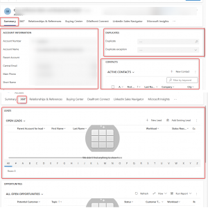
Of course, there could be even other solutions to this, like how it is done in CRM where the "Tabs" are the top and the "left an right panel" are rendered.
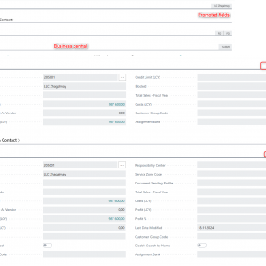
In Business central we can define "groups" in which we can display important and less important information. If a group is collapsed "promoted" fields are displayed.
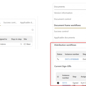
I will attach a few screenshots from other systems. Maybe other can share there ideas, too.
Best regards,
Daniel
Improvements for handling large forms (many fields) NOT NOW
I had an idea how we can use the CRM style layout right now. What do you think?
https://daniels-notes.de/posts/2024/dynamics-crm-style-tabs
We'll address your scenario alongside other form-related project in the future. I'm labeling the thread as "not now", but stay tuned to updates about forms :)


