New behavior mode for Choice field - Autocomplete
Applies to version: 8.3.x and above; author: Przemysław Sierant
Introduction
The form field “Choice field” is used for selecting a value from a set list of choices (either predefined, or loaded from a data source). Until now, there were two ways of selecting these values: from a drop-down menu (default) and through a separate pop-up window (this option allows multiple values to be selected). Version 8.3 adds a new option to the list of Choice field behaviors: Autocomplete.
Behavior
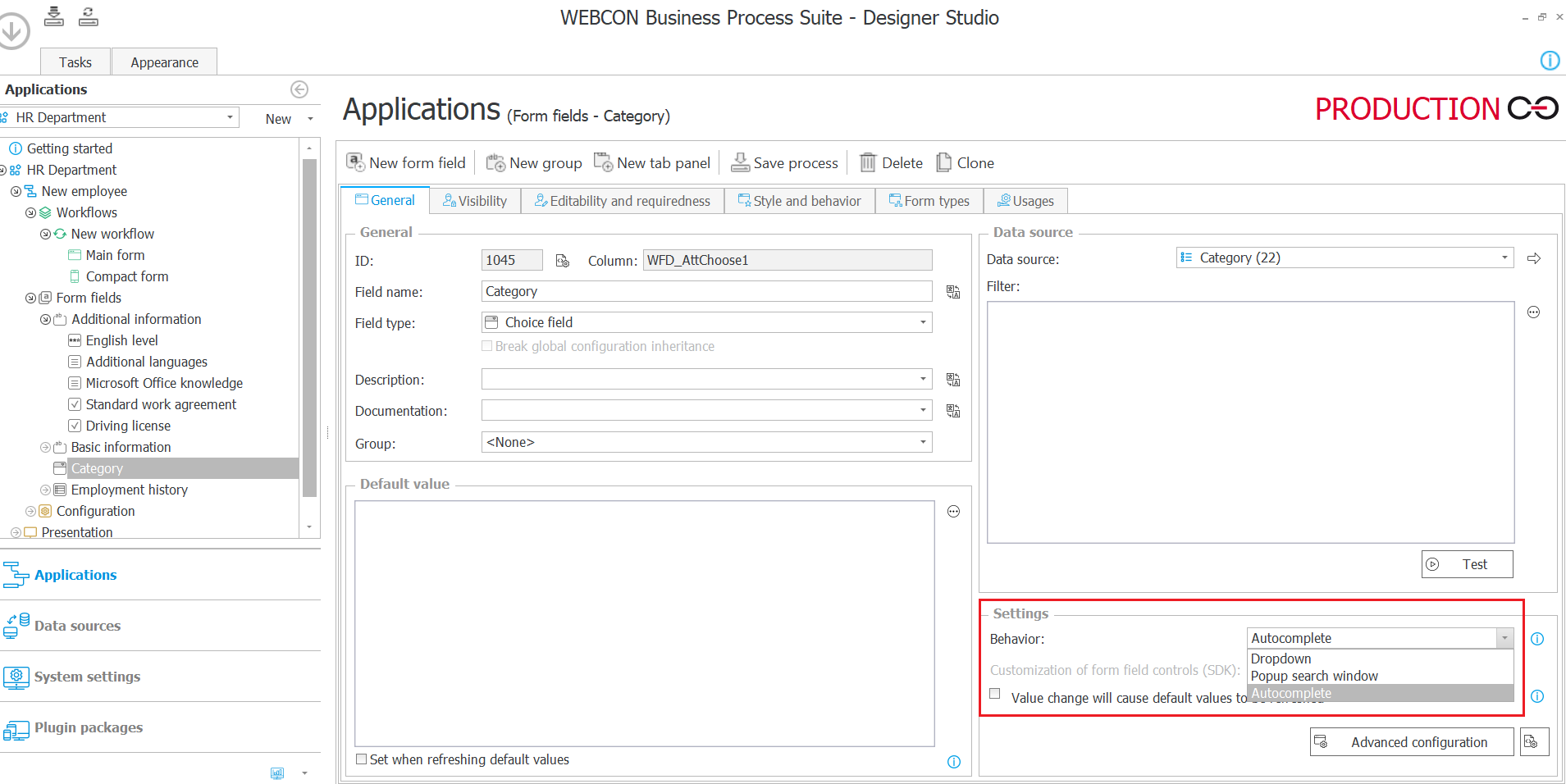
A Choice field working in Autocomplete mode is designed to help filter through a data source, and find the desired value. The autocomplete suggestions menu will expand after entering 3 characters into the field. Pressing the down arrow key, or clicking the drop-down arrow in the choice field, will expand a list of all available values.
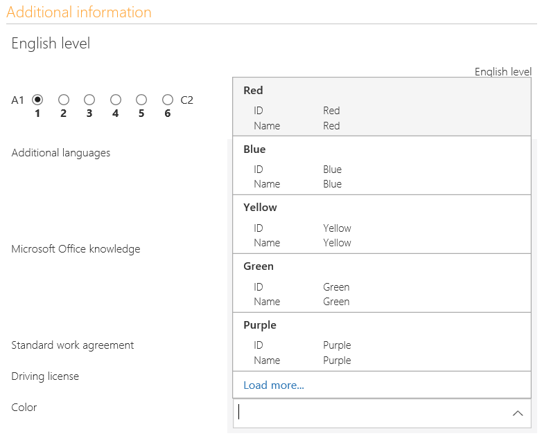
By default, the menu will display five values which best match what was entered into the field. If none of the displayed options are desired, the user can either continue typing in characters to narrow down the search or load extra options with the Load more... button at the bottom of the menu
Selecting a value is simply done by clicking it with your cursor, or highlighting using the up/down arrow keys and confirming your selection with the Enter key. When navigating the menu with arrow keys, you can jump from the first position to the last by pressing the up arrow, and from the last to first by pressing the down arrow. If it is possible to load more values, pressing the down arrow key while having the last (fifth) option highlighted will load the values automatically.
The maximum number of values that can be displayed at once is 100. If the desired value still doesn’t appear on the menu at this point, it will be necessary to enter more characters to narrow down the search.

Advanced configuration
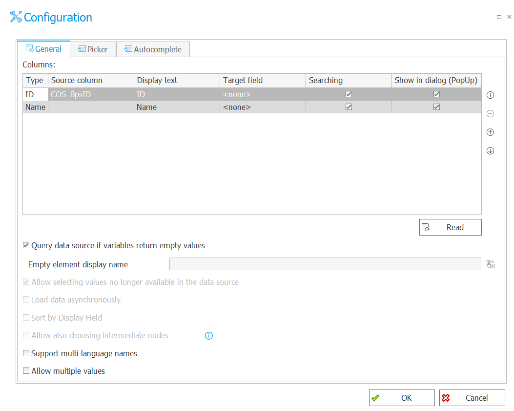
Configuring the new behavior mode is identical to that of the pop=up search window” mode, as a result it is possible to switch between Pop-up and Autocomplete behavior modes freely. In the field configuration, you can define what information is visible about each selectable value, and by which columns the data source can be searched. Columns returned by the specified data source can be added and rearranged in the Source column section of the configuration table.
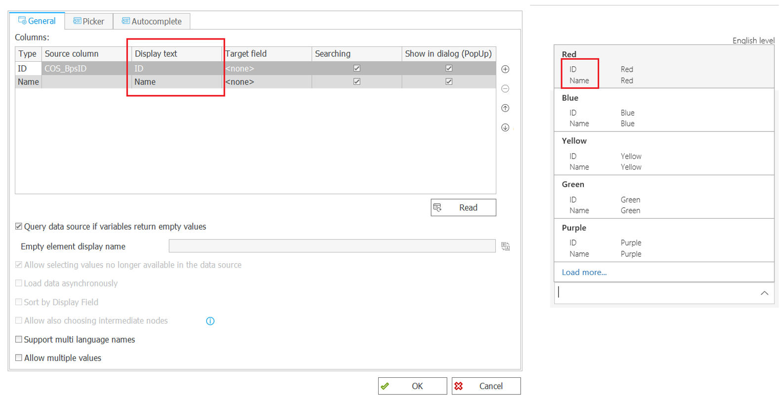
The “Display text” section is used for defining what labels will be used for source columns in the autocomplete menu. The source column whose “Display text” is set as “Name” will be displayed in bold, like so:
When a value is selected, the contents of one ore multiple source columns can be written into form fields defined in the “Target field” section. Selecting a value with autocomplete will automatically save its components into the defined target form fields.
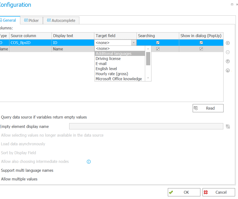
The “Search” section allows you to select which source columns will be searched for matching characters with the autocomplete field.
Visibility of individual source columns in the autocomplete suggestions menu is defined in the “Show in dialogue (PopUp)” section. Marking source columns will cause their information to appear in the autocomplete dropdown window.
The final section: “Unicode” enables/disables coding in Unicode format.

