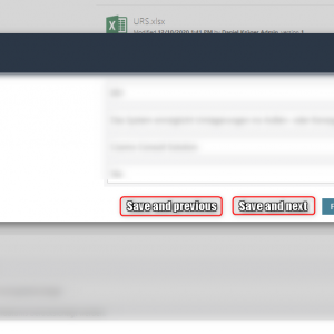
I have a few suggestions for improving the single row editing experience:
1. Adding a next/previous button to the modal dialog so that you can easily go through the rows.
2. No fixed height for modal dialog. The max height of 400px makes it quite hard use the modal dialog. It would be better if the available space is used. I already added a style overwrite for this.
3. If single row editing is used it would be better to display the icon on the left instead of the right side. Depending on the width of the item list the user needs to scroll and if you are unlucky the displayed info panel may hide the icon. Of course, I can't replicate the later case any more.
Off topic
It's nice to see that the status of some feedback moves on :)
Best Regards,
Daniel
Item list: Single row editing improvements IN BACKLOG
If the next/previous buttons get ever implemented, there should also be an option to configure/force field validation.


