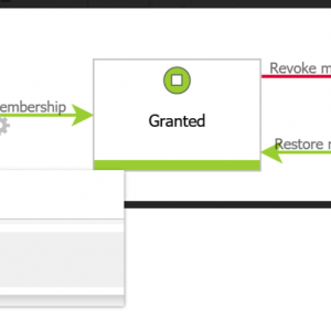
If possible, please add more colours to mark arrows in process design. It's very useful to mark arrows with same colour as buttons (paths). Currently there are grey (default), green, red, blue.
Thanks.
Add more colours to mark arrows in BPS process design DONE
While I'm fine with the available colours. I agree that the colour of the path in the designer should match the colour of the path buttons, like in the attached image. Of course there may be cases where it differs, even so I can not think of one.
Currently I have selected some colours whose text value I have to copy for each path. It would be great if we could use a rule or constant as a button style so that we can have a single place were this style is defined. Currently we would need to go to each path if there's a need to change the colour slightly.
Another option would be to add a four default definition to the Portal theme. One for each available path colour in the designer. If no button style is defined for the path in the designer the theme definitions would apply.
I had some time to think about this and it would be interesting to know how many colours are really needed.
One of the great parts of Webcon BPS is that it's intuitive. After you learned the basics you can take on any role in any process. Keeping this in mind I wonder how many colours are actually useful. They need to convey the same meaning in all processes. I don't think that you want to place a legend in your process to explain which colours are there and why they have been used.
The colour red and green are self explaining, so we have currently two colours left which usage the user can memorize. With each added colour it will get harder for the user as well as for the designer. He must have a cheat sheet when to use which colour.
Because of these reasons it would be interesting to know how everyone here uses the existing colours and for which cases he needs more colours. After we have a few opinions it may be easier for Webcon to decide whether there will be any changes to the path colours and if this suggestion (adding path styles to themes) https://community.webcon.com/forum/thread/41/15 will be incorporated into the change.
This is how I use the path colours in the workflow designer:
- Red path: Negative response, going backward in the workflow or leading to the negative final step
- Green path: Positive response, going forward in the workflow, final positive step is included here, or "reactivating" the workflow
- Blue path: Looping (save), the step is not left
- Grey path: Everything else
The path buttons are styled accordingly.
In addition I have the following use cases where I apply a colour to the path button:
- Orange: Paths which are only available in dev, mostly used for easier testing like a 'Back' path.
- Pink: Paths only visible in administration mode
Yes, I use colours which are not available in the workflow designer. But these paths are not available for a normal user, so they don't need to remember the meaning of these colours. :)
Are there more use cases for colours which can be applied across all workflows?


