Home > Forum > User Voice > Widgets field: Wishlist for additional capabilities

Widgets field: Wishlist for additional capabilities
3

MVP

Hi,

as always, when there's a new functionality, there will be immediately requests for a second improved version. :)

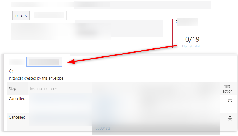
- Additional widget type 'Text', which will output any text and not only numbers. For example to display information like "open/closed" sub workflows: 2/4.
- A form rule can be executed what should happen when the user clicks on it. We could display a tab for example or execute a hyperlink or whatever.
- A form rule to trigger the refresh of the widget. Can be useful if a subworkflow was started/completed in a modal.

Best regards,
Daniel

I agree, I don't use it yeat (I'm in Webcon 2022 ...) , but I see limitation.
I would like to have something like that as native:

[code="https://devrecipes.net/step-progres-bar-with-pure-css/"]

<!DOCTYPE html>
<html lang="en">
<head>
<meta charset="UTF-8">
<meta name="viewport" content="width=device-width, initial-scale=1.0">
<title>Dynamic Stepper</title>
<style>
.stepper-wrapper {
margin-top: auto;
display: flex;
justify-content: space-between;
margin-bottom: 20px;
}
.stepper-item {
position: relative;
display: flex;
flex-direction: column;
align-items: center;
flex: 1;
}

.stepper-item::before {
position: absolute;
content: "";
border-bottom: 2px solid #ccc;
width: 100%;
top: 20px;
left: -50%;
z-index: 2;
}

.stepper-item::after {
position: absolute;
content: "";
border-bottom: 2px solid #ccc;
width: 100%;
top: 20px;
left: 50%;
z-index: 2;
}

.stepper-item .step-counter {
position: relative;
z-index: 5;
display: flex;
justify-content: center;
align-items: center;
width: 40px;
height: 40px;
border-radius: 50%;
background: white; /* Zmienione wypełnienie na białe */
margin-bottom: 6px;
border: 2px solid #ccc; /* Dodana szara obwódka */
}

.stepper-item.active .step-counter {
border: 2px solid black; /* Czarna pogrubiona obwódka wokół aktywnego kroku */
}

.stepper-item.completed .step-counter {
background-color: #4bb543;
border: 2px solid #4bb543; /* Dopasowanie obwódki do koloru wypełnienia dla ukończonego kroku */
}

.stepper-item.completed::after {
position: absolute;
content: "";
border-bottom: 2px solid #4bb543;
width: 100%;
top: 20px;
left: 50%;
z-index: 3;
}

.stepper-item:first-child::before {
content: none;
}
.stepper-item:last-child::after {
content: none;
}

.stepper-item.active .step-name {
font-weight: bold; /* Pogrubienie tekstu w aktywnym kroku */
}
</style>
</head>
<body>
<div class="stepper-wrapper">
<div class="stepper-item">
<div class="step-counter"></div>
<div class="step-name">D0</div>
</div>
<div class="stepper-item">
<div class="step-counter"></div>
<div class="step-name">D1</div>
</div>
<div class="stepper-item">
<div class="step-counter"></div>
<div class="step-name">D2</div>
</div>
<div class="stepper-item">
<div class="step-counter"></div>
<div class="step-name">D3</div>
</div>
<div class="stepper-item">
<div class="step-counter"></div>
<div class="step-name">D4</div>
</div>
<div class="stepper-item">
<div class="step-counter"></div>
<div class="step-name">D5</div>
</div>
<div class="stepper-item">
<div class="step-counter"></div>
<div class="step-name">D6</div>
</div>
<div class="stepper-item">
<div class="step-counter"></div>
<div class="step-name">D7</div>
</div>
<div class="stepper-item">
<div class="step-counter"></div>
<div class="step-name">D8</div>
</div>
<div class="stepper-item">
<div class="step-counter"></div>
<div class="step-name">Zakończona</div>
</div>
</div>

<script>
// Tutaj ustawiamy wartość zmiennej krok
var krok = #{3123}#; // przykład, można ją dynamicznie ustawiać

var stepperItems = document.querySelectorAll('.stepper-item');

stepperItems.forEach((item, index) => {
var stepCounter = item.querySelector('.step-counter');
if (index < krok - 1) {
item.classList.add('completed');
stepCounter.textContent = '✓'; // Unicode dla ptaszka
} else if (index === krok - 1) {
item.classList.add('active');
}
});
</script>
</body>
</html>

[/code]

if you wish to test: >>> https://portal.webconbps.com/db/1/app/452/element/6828/form

MVP
In reply to: Paweł Tołoczko

I agree, I don't use it yeat (I'm in Webcon 2022 ...) , but I see limitation.
I would like to have something like that as native:

[code="https://devrecipes.net/step-progres-bar-with-pure-css/"]

<!DOCTYPE html>
<html lang="en">
<head>
<meta charset="UTF-8">
<meta name="viewport" content="width=device-width, initial-scale=1.0">
<title>Dynamic Stepper</title>
<style>
.stepper-wrapper {
margin-top: auto;
display: flex;
justify-content: space-between;
margin-bottom: 20px;
}
.stepper-item {
position: relative;
display: flex;
flex-direction: column;
align-items: center;
flex: 1;
}

.stepper-item::before {
position: absolute;
content: "";
border-bottom: 2px solid #ccc;
width: 100%;
top: 20px;
left: -50%;
z-index: 2;
}

.stepper-item::after {
position: absolute;
content: "";
border-bottom: 2px solid #ccc;
width: 100%;
top: 20px;
left: 50%;
z-index: 2;
}

.stepper-item .step-counter {
position: relative;
z-index: 5;
display: flex;
justify-content: center;
align-items: center;
width: 40px;
height: 40px;
border-radius: 50%;
background: white; /* Zmienione wypełnienie na białe */
margin-bottom: 6px;
border: 2px solid #ccc; /* Dodana szara obwódka */
}

.stepper-item.active .step-counter {
border: 2px solid black; /* Czarna pogrubiona obwódka wokół aktywnego kroku */
}

.stepper-item.completed .step-counter {
background-color: #4bb543;
border: 2px solid #4bb543; /* Dopasowanie obwódki do koloru wypełnienia dla ukończonego kroku */
}

.stepper-item.completed::after {
position: absolute;
content: "";
border-bottom: 2px solid #4bb543;
width: 100%;
top: 20px;
left: 50%;
z-index: 3;
}

.stepper-item:first-child::before {
content: none;
}
.stepper-item:last-child::after {
content: none;
}

.stepper-item.active .step-name {
font-weight: bold; /* Pogrubienie tekstu w aktywnym kroku */
}
</style>
</head>
<body>
<div class="stepper-wrapper">
<div class="stepper-item">
<div class="step-counter"></div>
<div class="step-name">D0</div>
</div>
<div class="stepper-item">
<div class="step-counter"></div>
<div class="step-name">D1</div>
</div>
<div class="stepper-item">
<div class="step-counter"></div>
<div class="step-name">D2</div>
</div>
<div class="stepper-item">
<div class="step-counter"></div>
<div class="step-name">D3</div>
</div>
<div class="stepper-item">
<div class="step-counter"></div>
<div class="step-name">D4</div>
</div>
<div class="stepper-item">
<div class="step-counter"></div>
<div class="step-name">D5</div>
</div>
<div class="stepper-item">
<div class="step-counter"></div>
<div class="step-name">D6</div>
</div>
<div class="stepper-item">
<div class="step-counter"></div>
<div class="step-name">D7</div>
</div>
<div class="stepper-item">
<div class="step-counter"></div>
<div class="step-name">D8</div>
</div>
<div class="stepper-item">
<div class="step-counter"></div>
<div class="step-name">Zakończona</div>
</div>
</div>

<script>
// Tutaj ustawiamy wartość zmiennej krok
var krok = #{3123}#; // przykład, można ją dynamicznie ustawiać

var stepperItems = document.querySelectorAll('.stepper-item');

stepperItems.forEach((item, index) => {
var stepCounter = item.querySelector('.step-counter');
if (index < krok - 1) {
item.classList.add('completed');
stepCounter.textContent = '✓'; // Unicode dla ptaszka
} else if (index === krok - 1) {
item.classList.add('active');
}
});
</script>
</body>
</html>

[/code]

if you wish to test: >>> https://portal.webconbps.com/db/1/app/452/element/6828/form

Hi,

something similar may be available in 2024 R2 if I understood it correctly in the webinar.

I was referring to the new widgets:
https://community.webcon.com/posts/post/widgets/465/3

I would have liked if the widgets could accept pure text like in the attachment (1).
Clicking on it could execute a form rule, for example to show a tab, navigate somewhere else or it could be used as a big button. :)

Best regards,
Daniel