Hi,
we just did the upgrade from 2021.1.3.434 to 2021.1.4.55:
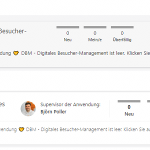
One of the changes also concerns the look of the portal elements.
Because we like to use longer application names, we now have a little problem with the limitation of space as you can see in the attached picture.
Maybe in upcoming versions it is possible to rethink this change.
Thanks in advance,
Bjoern Poller
PORTAL changes from 2021.1.3.434 to 2021.1.4.55: The space for application names is now far too limited DONE
Nobody has replied in this thread yet.


