Data analysis in WEBCON BPS
Applies to version: 2023.1.x and above, author: Krystyna Gawryał
Introduction
With the release of version 2023.1. WEBCON BPS gained a new feature for displaying statistical information about an application / a process. In Portal, users now have a dedicated Analysis node with tabs that compile key figures and time series in the context of available applications. It is now possible to track Trends on working with the system, as well as display a Heatmap for a selected application.
This article briefly describes those new capabilities of the system, focusing on the advantages of the feature that summarizes information about working with WEBCON BPS in an enterprise.
Key application indicators
The Analysis node is an expanded version of the previously available Insights node. The change affected not only the node’s name, but also its contents – as before, users will find Suggested workflow instances here, as well as information about possible Anomalies. However, a brand-new Analytics option has been added here, together with a subnode called Overview.
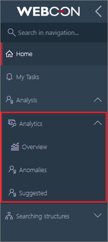
Altered side menu structure in Portal
Indicators per process
After selecting Overview, user will see Key application indicators, and more precisely, the Per process tab, whose content will vary depending on the applications used and privileges granted.
The data of individual applications in the report are grouped and displayed according to the current state, in alphabetical order, just like in WEBCON BPS Designer Studio. When you click on an application, a list of its processes is expanded, and when you click on a process, a list of related workflows is displayed.
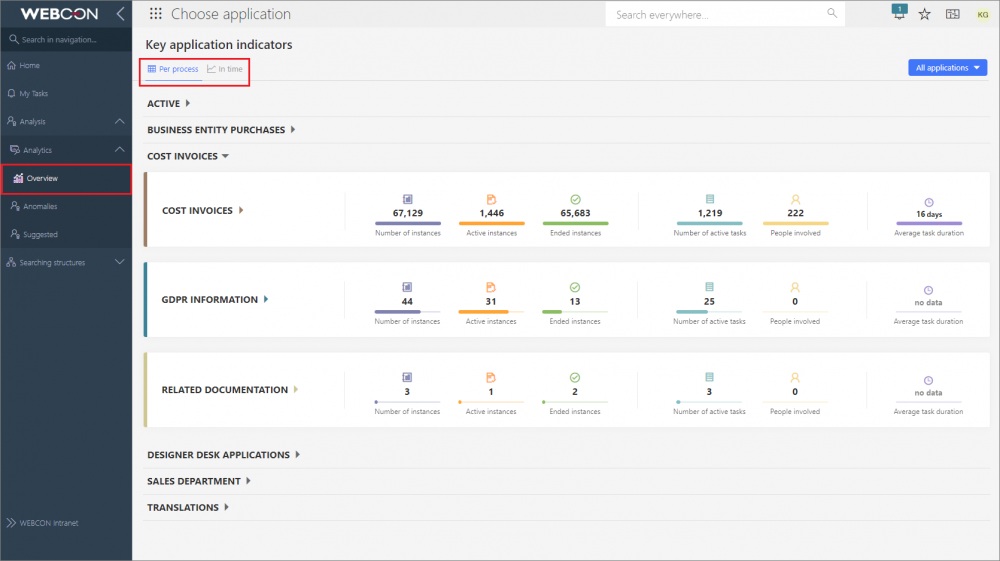
Statistics of selected applications
Each such data set contains the following information:
- Number of instances
- Active instances, i.e. instances outside the final step
- Ended instances, i.e. instances in the final step, either positive or negative
- Number of active tasks
- People involved, i.e. users who completed at least one tasks on their own and whose tasks are not canceled
- Average task duration (applies only to completed tasks).
If no values are available for any of the parameters, the parameter will be grayed out and the information no data will be displayed for it.
By default, global business administrator will see in the report the data of all processes and applications.
Similarly, business administrator of a process will see the data of only those processes to which they have access.
If a user does not have business administrator privileges to any process, Key application indicators report will not be visible to them.
In the upper right corner of the screen, there is a filter to narrow down the report view to the data of a selected application, process, workflow, or even a step.
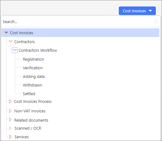
Choosing the level of data presentation
The above indicators can also be accessed from the selected application. The filtering is then automatically limited to that specific application, and the indicators prepared only on the basis of related statistical data.
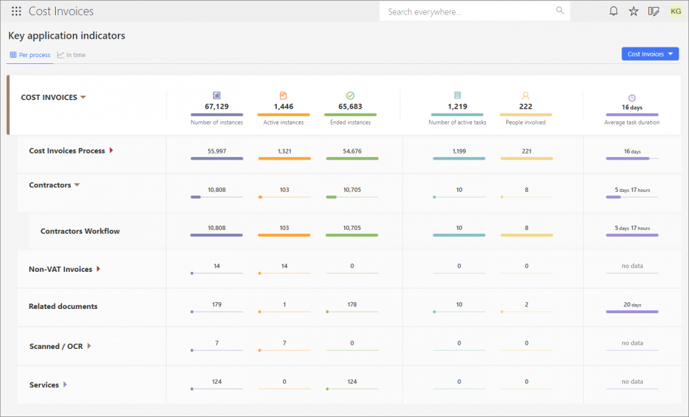
Statistics of the "Cost Invoices" application and its selected processes and workflows
As can be seen in the figures above, users get a ready-made package of information about working with WEBCON BPS – they can see which applications, processes, workflows are used most and which less often in the organization. They can also analyze the human and time input for each task in the company.
Indicators in time
As previously mentioned, the new feature facilitates independent analysis and evaluation of key information in the field of implemented business processes. However, the user can additionally see how the figures for working with workflow instances are shaping up over the periods defined by them.
For the purpose of such analysis, the Key application indicators page has a dedicated tab, In time. It is a report that provides a visual representation of information organized over time. Here, users can check the number of individual instances, operations, and tasks, as well as the time spent on their processing and execution.
If a filter was used in Per process section to narrow down the displayed information, for example, to a selected workflow, the filtering settings will be automatically inherited on this tab (and vice versa).
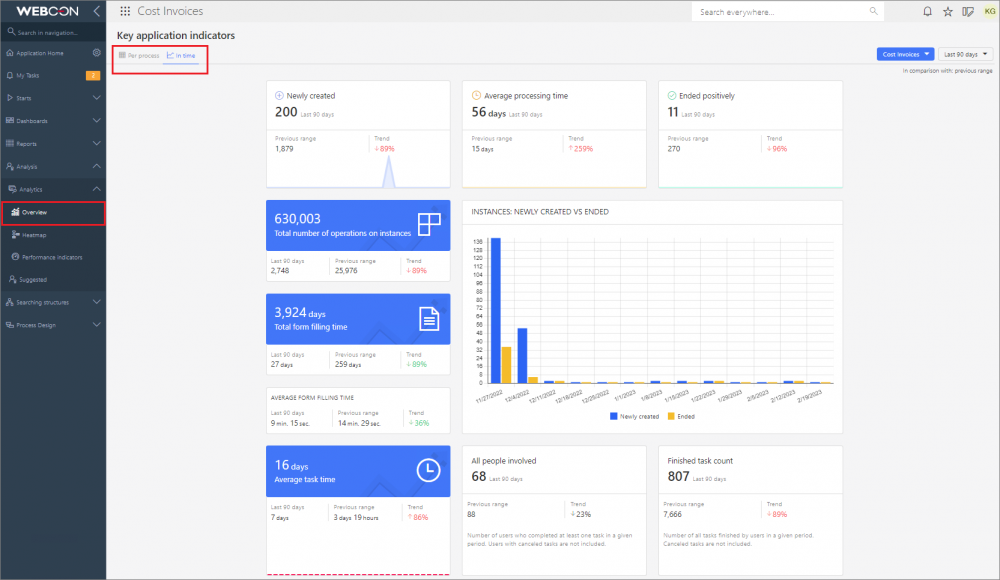
Indicators summarizing the work with the "Cost Invoices" application in the selected time period
The tab consists of the following indicators:
- Newly created
- Average processing time
- Ended positively
- Total number of operations on instances
- Total form filling time
- Average form filling time
- Average task time
- Instances: Newly created vs Ended
- All people involved
- Finished task count
By default, data from the last 90 days are presented. The user can independently define the period for which statistics will be displayed or choose one of the predefined ranges expressed in days, months, quarters, or years. A dedicated filter in the upper right corner of the tab is used for this purpose.
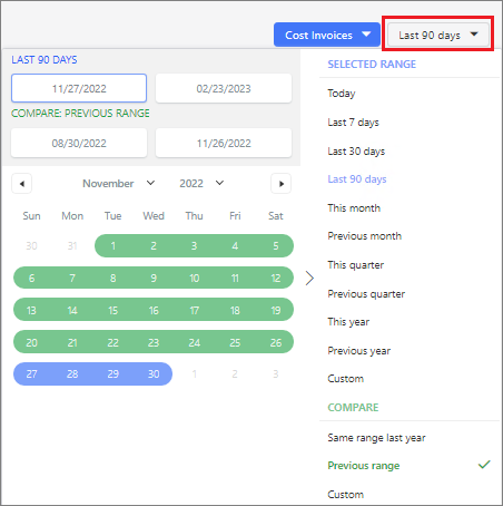
Default time filter settings
Additionally, it is possible to compare data from the corresponding Previous range (e.g., year-on-year), thus obtaining visualization of Trends for all presented parameters, i.e. related to the tasks performed and the time spent on them or working with the form, etc.
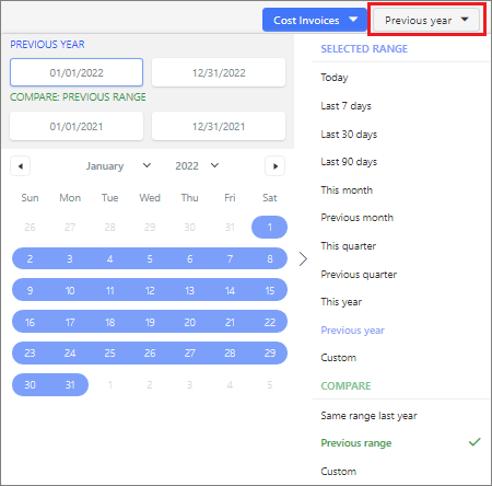
Default time filter settings
After indicating the preferred time period in the filter, the data presented in all sections of the tab will be changed accordingly.
Note: trend line charts show data from the last 30 days, regardless of filter settings.
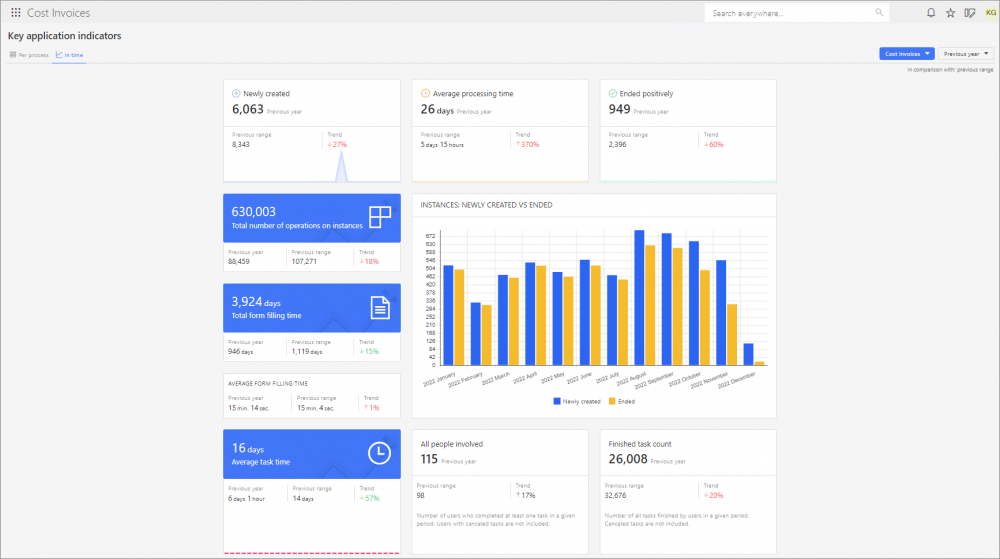
Indicators of the "Cost Invoices" application after narrowing the data down to the previous year
As can be seen in the figure above, when Previous year is selected as the time range, user is shown statistics for the entire year 2022 and, at the same time, they are compared with information from the corresponding Previous period, i.e. the entire year 2021. These data are used for the calculation and presentation of Trends, from which users can draw clear conclusions about the parameters of interest and their change over time.
Heatmap
Users who would like to analyze statistical data of a specific application, after opening it and navigating to a dedicated node in the menu, will be able to view Heatmaps of the workflows that belong to it. On each such workflow its "hot" and "cold" points are marked. Steps and paths are highlighted according to the frequency of their selection by the form user and the time spent on tasks, as shown in the legend below the workflow. The arrangement of steps and paths of the displayed workflow is as configured in WEBCON BPS Designer Studio – it is possible to alter it, but the changes made cannot be saved.
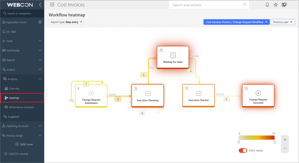
Heatmap of the selected workflow of the "Cost Invoices" application
Users can choose from the following report types:
- Step entry
- Step re-entry
- Time spent in step (total/average)
- Task waiting time
- Form filling time (total/average)
- Overdue tasks
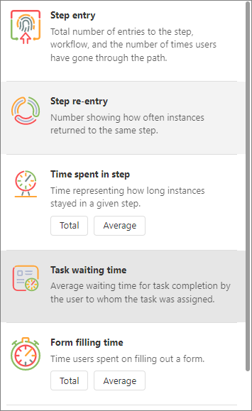
Expanded list of report types
Depending on the selected report type, an integer or timestamp (to the nearest 1 hour, minute, or second) value is displayed in the upper left corner of the step and next to the path.
A report can be filtered by:
- users who have had tasks assigned to them in a process – this filter is only available for the reports Task waiting time, Form filling time, and Overdue tasks;
- workflow – the first workflow of the first application process is displayed by default);
- period.
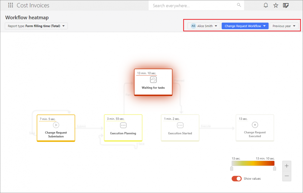
Heatmap of the "Cost Invoices" application with the filters set for users, workflow, and period
Note: if necessary due to country-specific legal restrictions, filtering by users can be disabled by setting “0” for the TopUsersEnabled global parameter in the configuration database (the default value is “1”).
By moving the slider on the legend (scale), user can change the range of values presented on workflow steps and paths. Additionally, proper setting of the Show values button allows to display the workflow according to individual preferences – with or without numerical data.
Heatmap is a tool that clearly illustrates the “popularity” (over a certain time period) of individual workflow steps and paths among people with assigned tasks. Consequently, it provides valuable information that is the basis for further optimization of the workflow, process, and even the entire application.
All the above reports, overviews, and indexes are prepared on the basis of information processing enabled by the OLAP role of WEBCON BPS Workflow Service.
Please note that ONLY users with WEBCON Advanced Analytics Framework license have access to analytical reports and indicators as part of the feature describe herein.
Summary
The feature of data Analysis in WEBCON BPS presents the most important statistical information about working with the system. Users no longer have to compile and compare these data on their own, and have access to them in one place. This makes task completion more measurable, which can be an additional motivating factor in the company. The Key application indicators available under the new Portal nodes, similarly to the Heatmap, provide information on the "weak points" in a process or workflow, as well as elements that need improvement. Users can follow the Trends – if the situation changes for the better, it is a signal that the actions taken are right, if for the worse, it is easy to check since when this state has been present and look for its cause.
In addition, the available data can be used as a tool to develop key performance indicators (KPIs) in the organization, and thus measure the degree to which its operational and strategic goals were met.

