Applies to version: 2022.1.3 and above; author: Krystyna Gawryał
Introduction
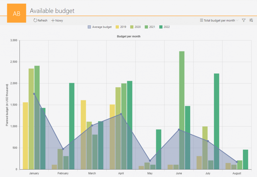
WEBCON BPS introduces many new features regarding the chart view in application reports. The list of charts has been complemented by new chart types, and it is now possible to customize the appearance of a chart, add data series, subgroups, present two charts on one view, and many more.
This article describes the updated report features and gives a brief overview of the new chart types. The business case used is the company’s budget planned for 2019-2022, broken down by selected months of the period.
Data series
• Manual configuration of data series
One of the new features relating to data visualization is the ability to define multiple series presented in a single view of a chart type report. In the Chart configuration, select the Views tab and press the Add series button to create a new data series – its parameters and appearance can be configured as needed using the available options:

Data displayed in the series can be dynamically shown or hidden by clicking on the series name. The predefined series names together constitute the chart legend.
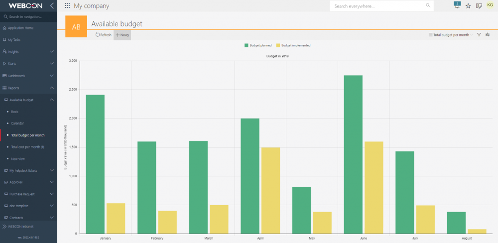
With this breakdown into series, the budget data is presented in a clear way.
• Subgroups in data series
The data based on which the chart is to be created can automatically form series, but for this to be feasible, it is first necessary to indicate by which parameters the data will be grouped. For this purpose, users now have the ability to specify Grouping for a single data series.

With this feature data can be presented in series, whose number will increase with the increasing amount of data recorded in the application. For example, defining grouping by year for a series that shows the total budget planned for each month of that year will cause the chart to automatically draw a series for the entire year.
Breakdown into year-subgroups is possible after adding a calculated column as part of the chart view configuration on the Report columns tab. The calculated column in the present case will be the time unit – year.
After selecting the Add calculated column button, a window will appear in which you should enter the appropriate SQL formula that returns the values of the years.
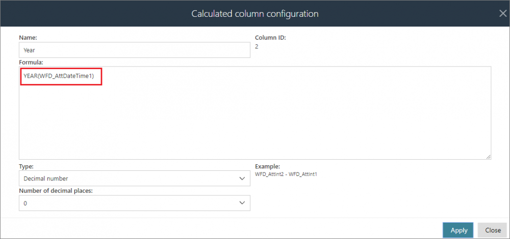
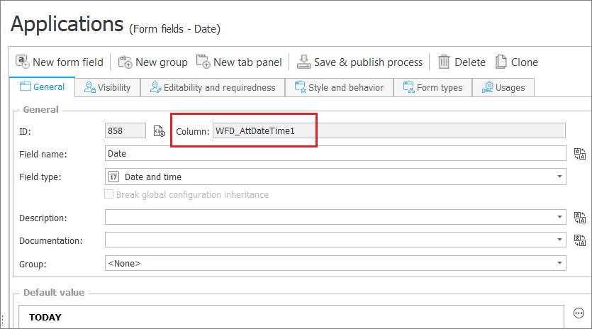
WFD_AttDateTime1 is the name of the field automatically defined when the Date and time form field is added in the application whose data will be presented in the chart.
After typing the formula, click Apply and then, select the defined column in the list of available columns.
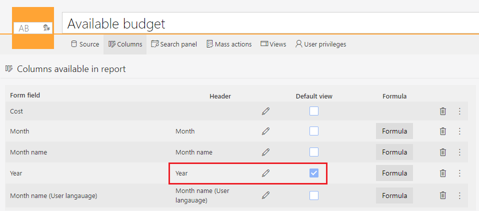
The Year column will now be available in the drop-down list in the Grouping section.
• Using the label description feature
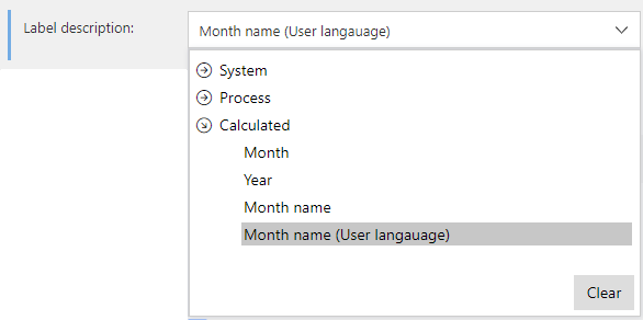
Users have the ability to independently define the value displayed as the chart’s X axis label. With this configuration, it is possible to present alternative text corresponding to the X axis values. In the present example, it will be a textual display of the name of the month corresponding to the date on the X axis based on the previously configured calculated column of the report.
By default, the label text is the value for the X axis.

In the Calculated column configuration window specify the name of the new column and enter an SQL formula that returns a text value in the form of month names. In the present case, this will be the Month name (User language) column.
.png)
#{USERLAN}# is a variable that will keep the month display names matching the user interface language.
Check the defined calculated column so that it is available in the default view:
.png)
and then select it from the drop-down list in the Label description section.
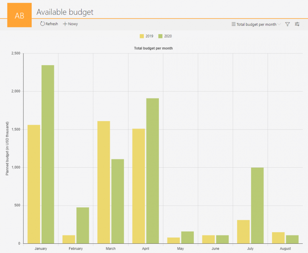
The changes made will be visible in the chart view – budget data will be presented by individual months of 2019-2020.
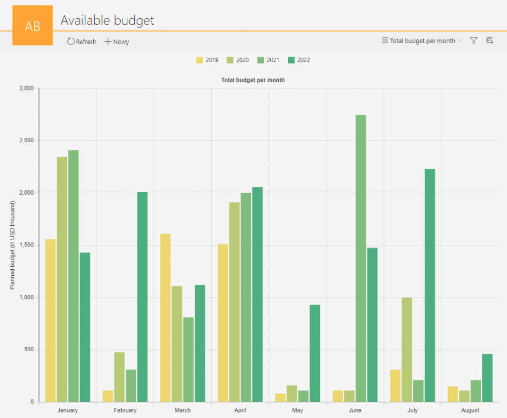
Entering additional data on the budget adopted for the following years (2021 and 2022) will automatically draw a series of data separately for each subsequent fiscal year broken down by selected months, without the need to change the chart configuration.
Custom chart appearance
The appearance of each series can be defined independently of the others. Depending on the Chart type selected for the data series, it is possible to customize parameters relating to the appearance of the chart, such as: fill color (including lightening/darkening), border style, width, color, visibility, radius, etc.
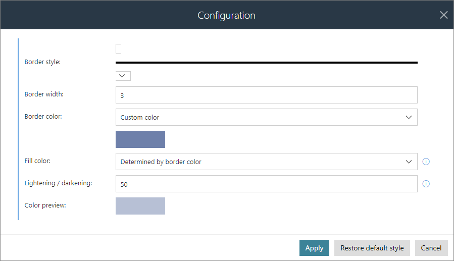
In each chart view, it is possible to configure the sorting of data by the selected series or the X axis value. The exceptions are series containing configured grouping. In that case, data is always sorted in ascending order by the X axis value.

The chart view also allows to specify whether the legend will be shown as well as its position.

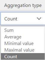
Users can also aggregate their data according to the 5 available aggregation types:
New chart types
The list of available chart types has been expanded to include the following items:
• Stacked (percentage) bar chart – displays data in the form of bars whose height is 100%. Depending on its value, each data series takes up a certain percentage of the bar.
• Horizontal bar chart – displays data in the form of horizontal bars.
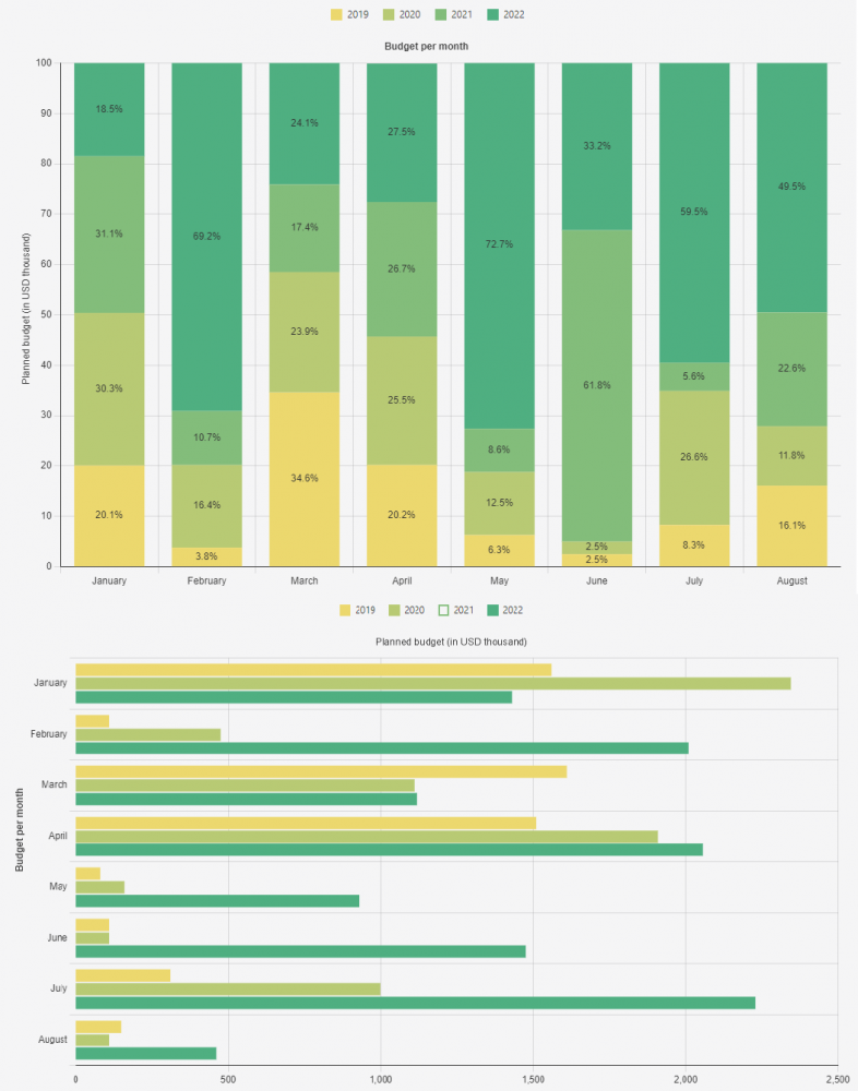
Stacked (percentage) and horizontal bar charts
• Floating bar chart
In the case of this chart type, the minimum and maximum values of the data group are calculated. The pair of numbers calculated in this way is presented in the form of a bar. The default aggregation type for the floating bar chart is Min / Max – using any other aggregation type is not possible.
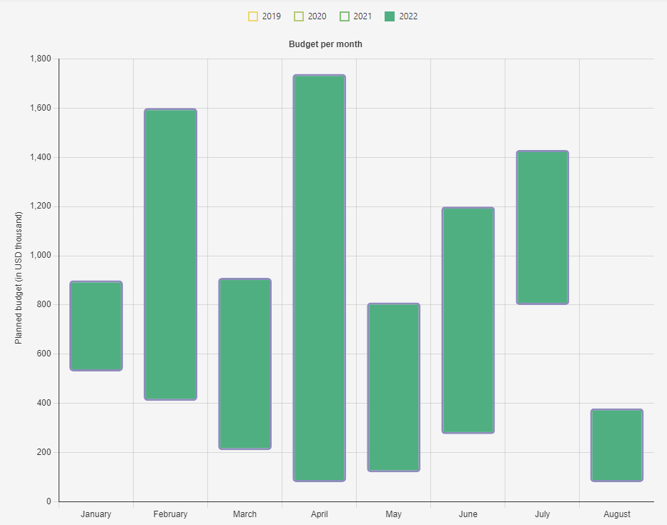
Floating bar chart
Other chart types
It is still possible to use line, bar, stacked, pie, and ring charts of any configured appearance for graphical presentation of data in a report.

Line, donut, pie, and stacked bar charts
Additionally, bar (including floating bar) and line charts can be combined in one view.
