Reports within dashboards
Applies to version: 2024 R1 and above; author: Łukasz Maciaszkiewicz
Introduction
Dashboards are virtual panels that facilitate navigation within a WEBCON BPS application. By enabling embedding various elements within them, dashboards provide not only access to specific application assets, but also data that may be relevant for end users.
This article discusses the possibilities offered by dashboards in terms of presenting such data in the form of reports, and describes how to create, configure, and feed those reports within dashboards.
Business case
The Head of the Complaints Department within a production company oversees the work of several employees in that Department. Both him and his subordinates use the WEBCON BPS application on daily basis to process complaints, so any information on the ongoing operations are registered in the BPS system. Given the growing number of complaints and the undergoing reorganization of work in the Department, a dedicated dashboard will be created for the Head of the Department. The reports embedded on the dashboard will help the Head in supervising their subordinates, managing their time, and taking decisions.
For a good start: preparing a new dashboard
As some of the information available to the Head of the Department should not be disclosed to their subordinates, a completely new dashboard will be created for them. This task is assigned to a member of an IT Department who holds the necessary privileges of Application administrator (this operation can be also executed by the System administrator) – we will take on their role in this article.
Please note that given the limited dashboard configuration options in Designer Studio (creating, naming, describing, and redirecting to the Portal page), the dashboard will be created and configured in Portal, i.e. its target location where it will be used by the Head.
- Creating a dashboard
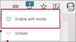
Go to the selected application home page and click the Edit button visible in the top right corner, then select the Enable edit mode option.
Next, click again the Edit button, select Add new, and choose Dashboard.
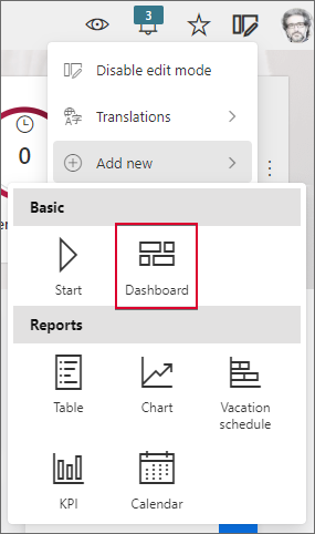
This adds new – “empty” – dashboard in the Portal window. Because the dashboard is meant exclusively for the Head of the Department, it might be a good idea to limit the access to it…
- The User privileges tab
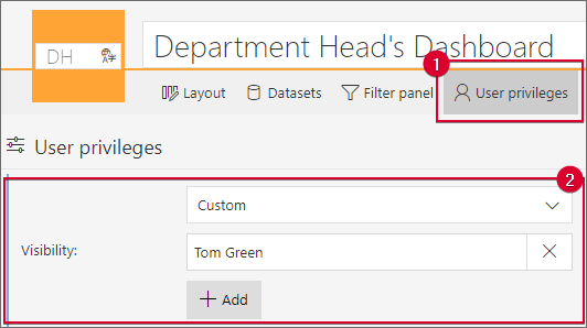
To change the settings that determine who can view the dashboard, navigate to the User privileges tab visible in its top menu. By default, the settings defined here are inherited from the application, but in the described case it is necessary to modify them to prevent other Department workers from viewing the dashboard. To do that, expand the drop-down list in the Visibility field and select the Custom value. Now, click the Add button and enter the details of the Head of the Department (for the described scenario this will be Tom Green).
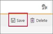
It is a good practice to regularly save the dashboard configuration to prevent data loss as a result of, .e.g., lost internet connection. To do that click the Save button provided in the top right corner.
- Adding a section to the dashboard
With the dashboard in place and configured privileges to it, lets prepare it for embedding the reports needed by the Head of the Department. This will involve creating a section, i.e. a dashboard area with specific layout which allows for embedding various elements.
To do that, click the plus button visible on the right side of the dashboard. Select the One-third right column option from the opened Section layout menu.
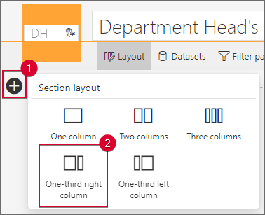
The selected option creates a section divided into two segments (big and small). This will allow you to embed a report in it, as well as a Report Tile in a later step, and clearly organize the dashboard area.
Reports on dashboards
The reports embedded within dashboards are independent of reports created in applications. This means that they are not only created and configured at a dashboard level, but also fed with data from data sources defined for such a dashboard. Although assigned to the dashboard, the aforementioned data sources are created while adding a report, and later can be reused to populate reports that match their type. What is more, the configuration of such a data source is then applicable to all the reports it feeds.
- Creating a tabular report
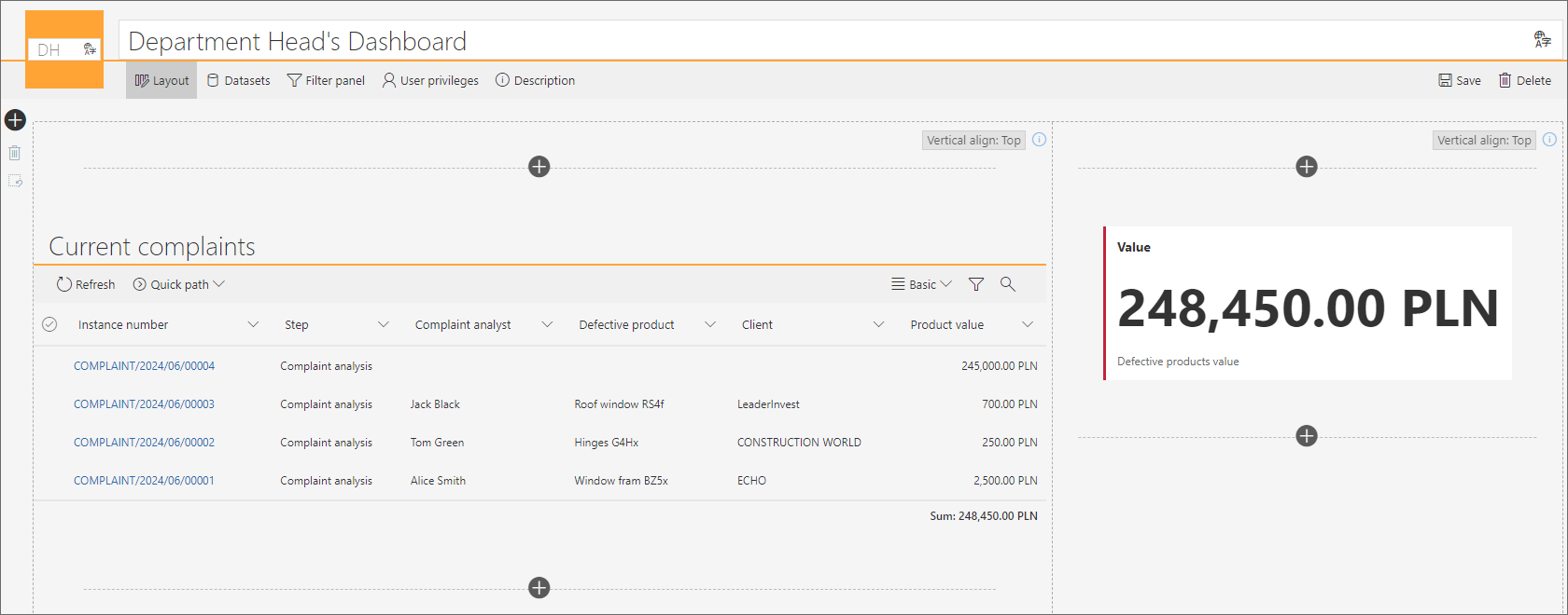
The discussed example involves adding a simple report in the form of a table that will include information about tasks currently executed by the subordinates of the Head of the Department. To add it, click the plus button provided in the bigger section segment and select the Table option from the Add new element menu.
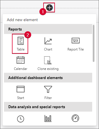
After selecting this option, you need to provide the data source (associate or create a new one) which will populate the created report with the information regarding the Department workers – without it the report will not be created.
- Creating and configuring a dashboard data source
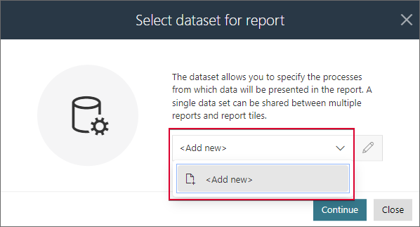
As a completely new dashboard has been created in the described example, it does not include any defined data sources. Therefore, click the drop-down list visible in the Select dataset for report window, select the <Add new> option, and press the Continue button.
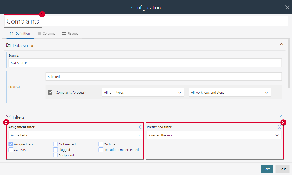
For a start, it is a good idea to change the data source name in the newly opened window to signalize its content, e.g., “Complaints” (if more data sources are created for the dashboard in future, this will help users to pick up the correct data source and associate with a given report). While in the Definition tab, also configure the Assignment filter by selecting the Active tasks value from the drop-down list, and the Predefined filter by choosing Created this month. As a result, the Head of the Department will get insight into tasks executed by their subordinates in the current month.
Then, navigate to the Columns tab to define the columns to be included in the data source. Some predefined system columns are visible by default, but from the perspective of the Head of the Department, it does not seem necessary to include them all. Therefore, leave only the [System] Instance number and [System] Step columns, and proceed to adding process form fields. In the described examples, these will include: “Requesting person”, “Defective product”, “Client”, and “Product value”.
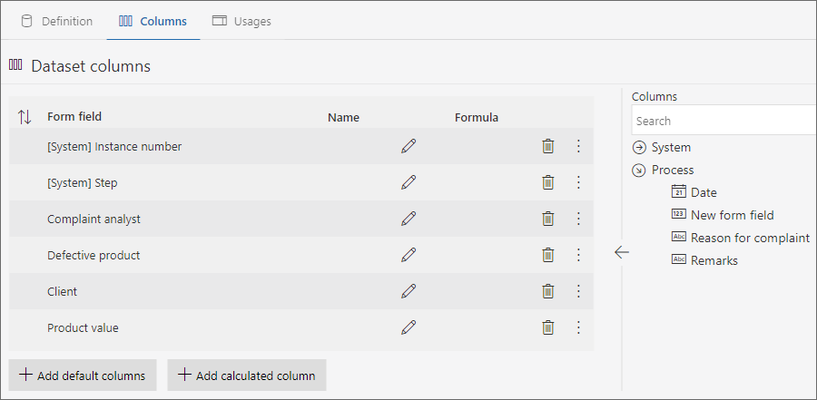
Please note that it is also possible here to configure column sorting within the data source. You can do that with the ![]() button visible in the top right corner of the Dataset columns table. This configuration can be changed later within the report column window.
button visible in the top right corner of the Dataset columns table. This configuration can be changed later within the report column window.
To conclude the creation and configuration of the data source, press the Save button located in the bottom corner of the window. Pressing it opens the report configuration window.
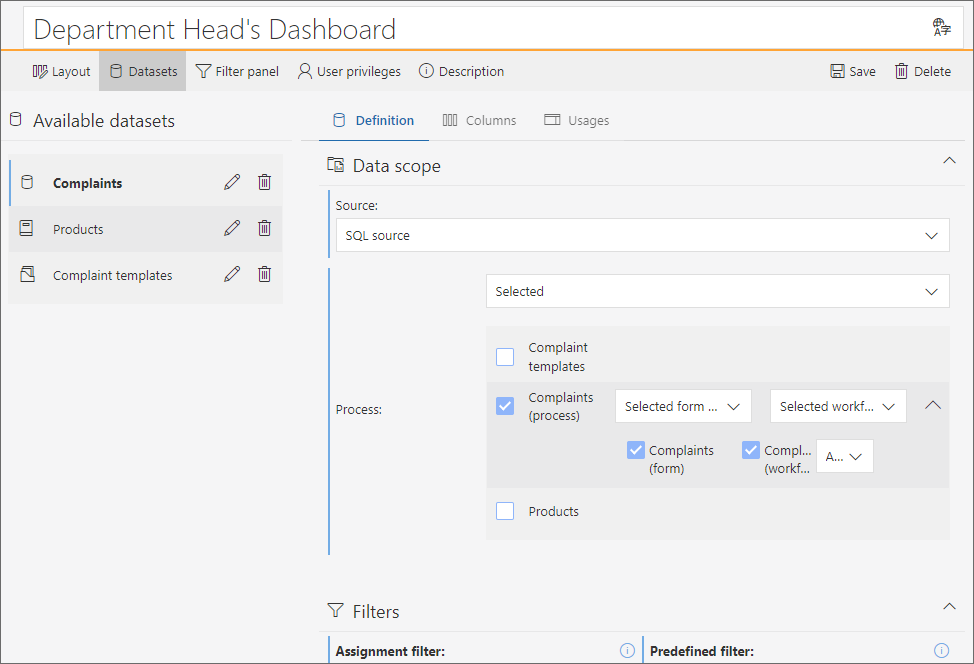
NOTE: you can manage the created data sources at the dashboard level. To do that, navigate to the Datasets tab in the dashboard menu. The tab presents all available data sources (the icon indicates the type of a given data source). Once you select a particular data source, you can modify its configuration in one of the three available tabs on the right side (their names, layouts, and contents correspond with the tabs provided during the data source creation step).
- Report configuration
The appearance of the report configuration window, including the availability of specific tabs and their contents, depends on the selected report type and corresponding data source.
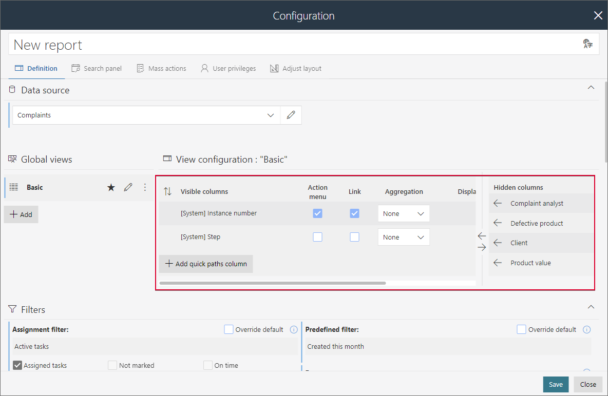
What is noticeable is that part of the configuration is transferred from the data source (i.a. Assignment filter and Predefined filter). This also partly applies to column settings (the View configuration section) where the system columns defined in the data source are included. However, since the process columns are hidden by default in the report view, you will need to add them manually. To do that simply click each column visible under the Hidden columns section.
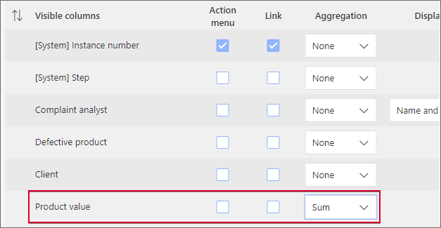
Additionally, set aggregation for the only numerical form field, i.e., “Product value”. For this purpose, set the Sum value in the Aggregation column for the corresponding row within the table.
It is also worth mentioning here the possibility of defining a custom location for such a report on the dashboard. This can be done in the Adjust layout tab. Here, you can define not only the height of the report widget (in the Height field), but also custom margins. In the latter case, simply select the Custom margin checkbox and enter the new pixel value in the respective field. (This step is skipped in the discussed example.)
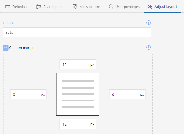
Finally, change the report name to “Current complaints” and press the Save button in the bottom right corner of the configuration window to add the report to the dashboard.

- Creating a Report Tile
The tabular report is a great source of detailed information. However, the Head of the Department also needs to be familiar with the overall financial context. Therefore, it is a good idea to utilize the capabilities offered by the Report tile. In the discussed example, it will be used to present the aggregated value of all accepted complaints within the current year.
To embed the aforementioned tile on the dashboard, click the smaller segment of the previously created section and select the Report Tile option from the menu.
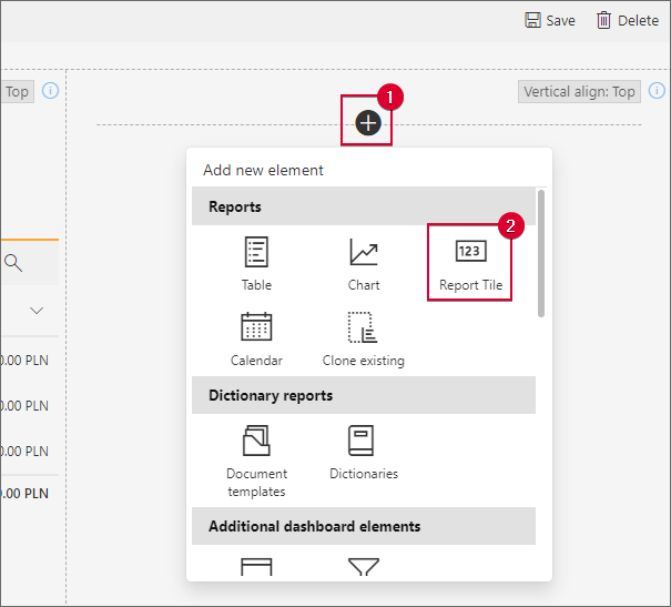
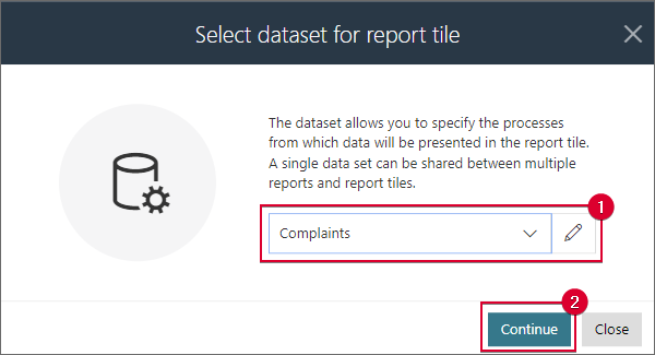
Similar to the Table, the Report Tile is also fed by the data source. However, this time the dashboard already has the previously created data source “Complaints” which can be utilized in this case.
Since this data source is suggested in the data source selection window, simply click the Continue button.
Clicking it opens the Report Tile configuration window. Since the tile is primarily used for presenting numerical data, the Configuration section (specifically the Definition tab) sets by default the “Product value” form field which is the only numerical form field in the discussed application.
Leave the settings in the aforementioned section unchanged and proceed to the filter settings below. As you can see, the configuration of the Assignment filter and Predefined filter corresponds with the data source configuration. However, let’s change them to give the Head of the Department information on only the complaints registered within the current year.
To do that, select the Override default checkbox in the Assignment filter field and choose All from the drop-down list. Repeat that for the Predefined filter field – select the Override default checkbox and choose Created this year from the drop-down list.
The option used in this situation does not impact the settings of the data source itself.

Now, let’s adjust the appearance of the tile. You can do that in the dedicated Style tab. It contains a number of options that will allow you to customize the tile to match the preferences of the Head of the Department.
In the Tile layout scheme field, select Left accent from the drop-down list. Next, select the Bold font checkbox, enter “The value of registered products” in the Footer text field, and check the Bold font option again. You can see the result of all the modifications in the tile preview provided on the right side.
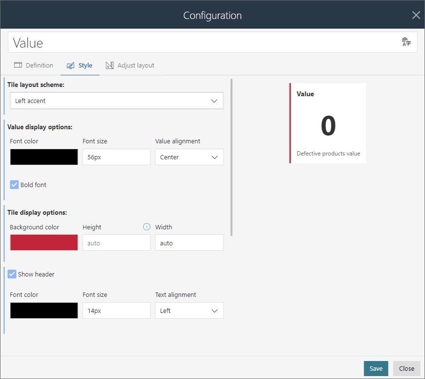
After inputting the settings, click the Save button. The added Report Tile is now visible on the dashboard. You can now compare its value with the cumulative value presented on the Current complaints report. Of course, the difference results from overriding the data source filter in the tile settings.
- Cloning the report
The application used in the Complaints Department also includes several older application reports that were created much earlier. Among them is a chart report that presents the aggregated value of complaints in specific months within the current year. Including it on the created dashboard will certainly help the Head of the Department to spot trends and take actions in advance.
To embed the aforementioned report, let’s use the functionality that allows users to clone the existing reports, i.e., Clone existing. It enables users to clone the entire configuration of the selected report or Report Tile that is embedded on the dashboard, as well as application reports. It is worth remembering that the cloning operation also includes the data source that feeds a given element, except when copying reports and Report Tiles within the same dashboard.
To clone the existing report, add a new section below the existing one by selecting the One column layout.
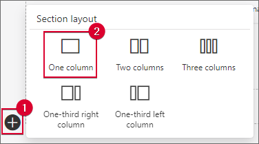
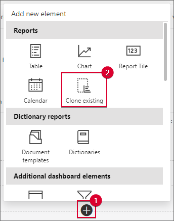
Click the plus button in the section segment, then select Clone existing from the menu.
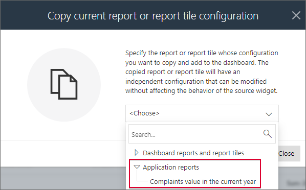
In the newly opened window, select the report to be cloned from the selection tree. In the discussed example, this is the application report named “Complaints value in the current year”.
Selecting the report opens its configuration window. It allows you to modify the cloned element immediately before embedding it on the dashboard. In the described example, all the original configuration is preserved without any changes.
Press the Save button located in the bottom right corner.
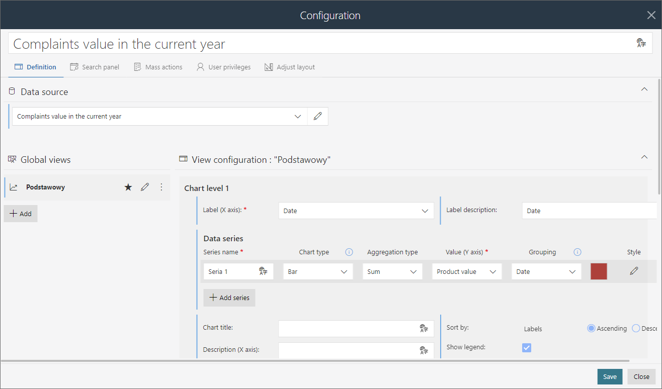
Pressing the aforementioned button clones and embeds the report on the dashboard. (Additionally, the data source that feeds the report has been copied and added to the dashboard’s Data Source tab.)
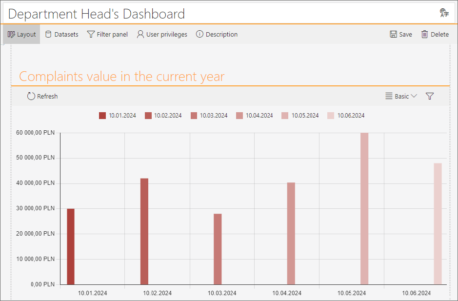
Finally, save the dashboard itself. To do that click the Save button provided in the top right corner of the window. Additionally, disable edit mode (the Edit button → Disable edit mode) to see the final appearance of the configured dashboard.
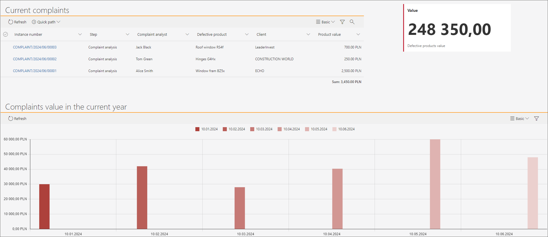
With the dashboard configured in this way, the Head of the Department can access all the necessary data. To make viewing easier, the report view can be expanded to cover the entire internet browser window by clicking on the report heading.
Summary
Dashboards allow application designers to quickly and easily adapt the appearance of a given application to the needs of specific end users. The presented options for creating, embedding, and cloning reports on dashboards will certainly be appreciated by users whose work depends on timely access to specific information.

