Widgets
Applies to version: 2024 R1 and above; author: Łukasz Maciaszkiewicz
Introduction
Fast and easy access to information is one of the key aspects of a well-designed form. With crucial information readily available, users can not only perform tasks faster, but also make better decisions in the process. But how do you distinguish this crucial information from other data and present it clearly to make it easy to interpret?
Perhaps the answer lies in the Widget form field discussed in this article…
What are Widgets?
In the context of a form, a Widget is a form field that presents numerical data defined by the user in an appealing way. It belongs to the Data presentation group and, like other form fields in this group, operates in the read-only mode, meaning it is not possible to edit its value at the form level. What sets it apart from other form fields is its appearance; the values are presented in a visually appealing format intended to draw the user's attention. The combination of the aforementioned visual format and the ability to present data against other values makes this form field especially useful when making good and prompt decisions depends on the user's ability to analyze the situation swiftly.
Business case
The “Projects” application, developed in Designer Studio, is utilized by the Sales and Pricing Department of the construction company. The application is used by employees responsible for preparing offers, as well as their superior, who also serves as the Head of the Department. Once an offer is accepted by the investor, the Head can also monitor the project execution within the application.
The application form includes numerous form fields, including a significant number of numerical fields. The abundance of these fields has led end users to complain about its lack of clarity. To streamline operations within the department, the application designer decided to incorporate several Widgets into the form to display key data.
When hard data matters: the Numeric value type Widget
For obvious reasons, many of the numerical fields on the form display financial data. The values entered in these fields typically pertain to investment costs and budget, making them fundamental information for all parties involved.
Therefore, it seems to make sense to highlight the most critical value: the project execution cost. To do that, go to Designer Studio, select the Form fields node in the selection tree, and add a new field named “Project execution cost”. In the Field type, choose the Data presentation node and select Widget. Then, click the Advanced configuration button.
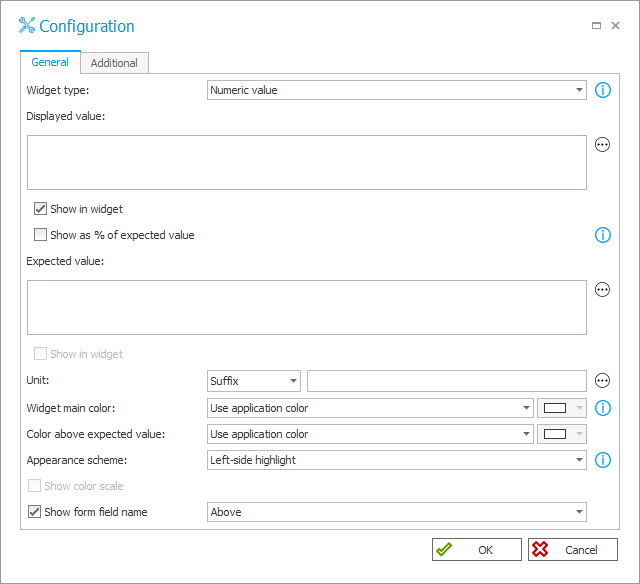
Now, it's best to begin the form field configuration by defining its type. Since the configured Widget should draw attention to a specific numerical value, leave the Numeric value option selected in the Widget type field (it is selected by default upon opening the configuration window). As a result, the specified value will be presented within a tile whose appearance is defined by the application designer.
Next, go to the Displayed value field where you can enter the value shown within the Widget. Similar to other fields in the Widget configuration window used for defining values, this field allows users to enter a numerical value directly or input it indirectly via a variable or a form field. Since the Department's application form includes a form field that displays the total project cost (“Total cost”), click within the empty space of the text field (or open the variables editor using the ellipsis button) and enter the aforementioned form field.
Please remember to keep the Show in widget checkbox selected (it is selected by default). Otherwise, the defined value will not appear on the Widget.
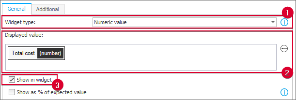
NOTE: the values presented on the Widget are numerical. Consequently, the form fields that you can enter in the fields used for defining the Widget value (such as the Displayed value field) must belong to one of the following types: Integer number, Floating-point number, Date and time, Rating scale, Data row, and Choice field.
In addition to the previously provided value, it is also advisable to specify the Expected value. It is typically used as a reference point for the Displayed value. However, for the Numeric value Widget, it is not included within the tile (the Show in widget field is inactive). So why is it important to include it?
It can be used to change the Widget's appearance. After exceeding the specified value and defining a corresponding color for it, the Widget will change its color to signal the need for closer examination of the project cost.
Therefore, in the Expected value field, enter the “Budget” form field, which represents the customer’s financial capabilities. When exceeded, the widget tile changes color.
Additionally, in the Unit field, leave the Suffix option selected (it is selected by default), and enter the code for European currency (“EUR”). As a result, a defined suffix will be added next to the displayed value.

Once the value is defined, you can proceed to configure the Widget's appearance. The configuration options here generally apply to colors. One of the purposes of the configured widget is to draw users' attention when the total project cost exceeds the available budget. Therefore, go to the Widget main color settings, where you can define the dominant tile color, and select Use custom color from the drop-down list. Next, click the color palette button on the right and select a neutral color (e.g., green) that will not attract users' attention when the project cost is within the budget.
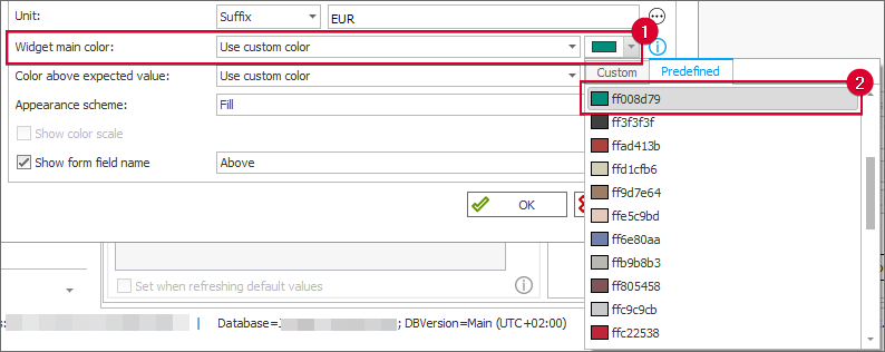
Then, repeat the procedure for the Color above expected value field, but this time select a more vivid color, such as red, from the color palette. Thanks to this, the tile color will change when the budget is exceeded, signaling potential complications to the user.
It is important to remember that for the configured Widget type (and only for this type), the Appearance Scheme field is active. This field allows users to decide if and how the selected color appears on the widget. From the four available options, select Fill.
After configuring the form field availability in Field matrix and saving the configuration, the added Widget appears as follows:
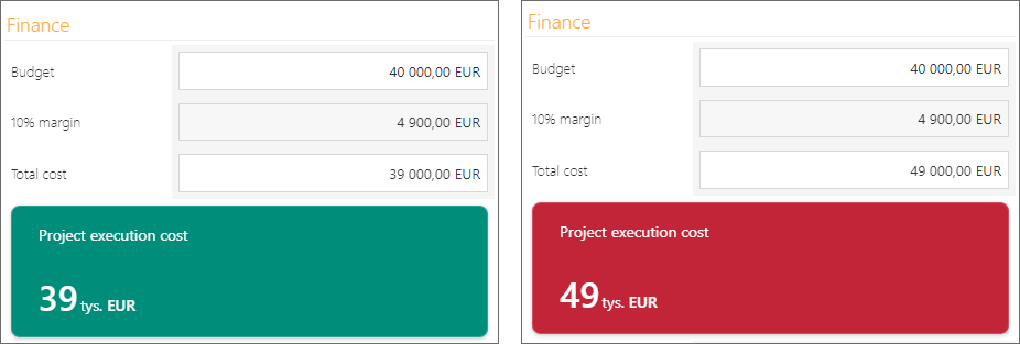
One widget, two views: on the left, the project cost is within the budget (40,000 EUR); on the right, it exceeds the budget.
The devil is in the details: data analysis
The Numeric value Widget added to the form will certainly enable users to quickly assess the feasibility of sending a particular offer to an investor. In such cases, the Department workers often analyze a given offer and its cost components, aiming to align investor expectations with their capabilities. To facilitate this process, let’s provide them with appropriate tools, specifically suitable widgets…
- Financial data in context
As the total project cost and the budget are the two most important pieces of information for the Department workers, comparing this data using the Gauge Widget is a good idea. (Please note that despite their different appearances, the Progress bar and Circular progress bar Widgets provide the same functionality.) To accomplish this, in Designer Studio, add a new widget named "Project cost against budget" and navigate to its advanced configuration window. In the Widget type field, select the Gauge option. This Widget type enables you to compare two values and define value ranges, thereby providing context that was missing in the case of the Numeric Value Widget.
Begin the configuration by entering the "Total cost" form field variable in the Displayed value field and the "Budget" variable in the Expected value field (remember to select the "Show in widget" checkbox) and provide the Suffix (EUR). Next, define the required colors for the Widget in the Widget main color and Color above expected value fields.
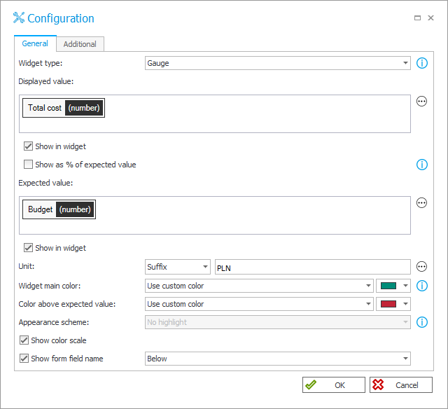
Configuration of the Gauge Widget. Please note the selected Show color scale checkbox (unavailable for the Numeric value Widget). The option includes a smaller arc line below the Gauge, indicating the value range with different colors.
Navigate to the Additional tab. Here, you can define additional values presented on the Widget, including minimum and maximum values (defining the beginning and the end of the Widget range). To display the minimum value of "0", simply select the checkbox below the Minimum value field. If the field is empty, the system will automatically enter the value "0". Now, enter the "Total cost" form field into the Maximum value field and select the Show in widget checkbox.
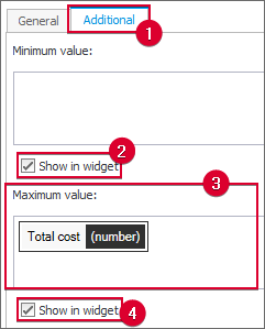
The configuration minimum and maximum values.
It is time to share a little secret: while the company typically applies a 10-percent margin to each project by default, there are cases where it can deviate from this rule. Now that the secret is revealed, it seems reasonable to include the margin in the configured Widget. To do that, select the Additional coloring conditions checkbox. This functionality allows you to apply additional colors to the Widget whenever a specified value (threshold) is exceeded.
Once you select the aforementioned checkbox, choose Percentage in the Threshold type column of the table below [the threshold will be calculated as a percentage of the specified value (basis)]. In the Basis column, choose Maximum value (i.e., the total project cost in this case), and set 10% in the adjacent column. Finally, select the color to be applied when a specific condition is met.

Configuration of additional coloring conditions.
After entering the configuration and saving the changes, the Widget appears as follows:
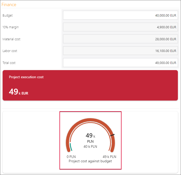
The Gauge Widget presents a wide range of information. The green section of the scale represents a 10-percent margin, the black mark represents the Expected value (the budget), and the wide, outer line represents the Displayed value, whose color depends on exceeding the defined range or threshold. On the left and right sides of the Gauge, you can find the minimum and maximum values, respectively.
TIP: if there are many widgets on the form, consider grouping them within a form field group and using Horizontal arrangement of form fields in group. You can also enable Wrap fields in horizontal arrangement to ensure that form fields are placed one below the other if the screen width is insufficient. For example, in the discussed case, two additional widgets have been created, but now their type is Circular progress bar (the difference compared to the Gauge Widget applies to appearance only). These widgets present labor and material costs against the total project cost, excluding the margin. [In both cases, the values are presented as a percentage of the Expected value (the Shown as % of expected value checkbox is selected).] Both Widgets have been placed within a group, and the aforementioned options have been enabled. As a result, they appear on the form as follows:
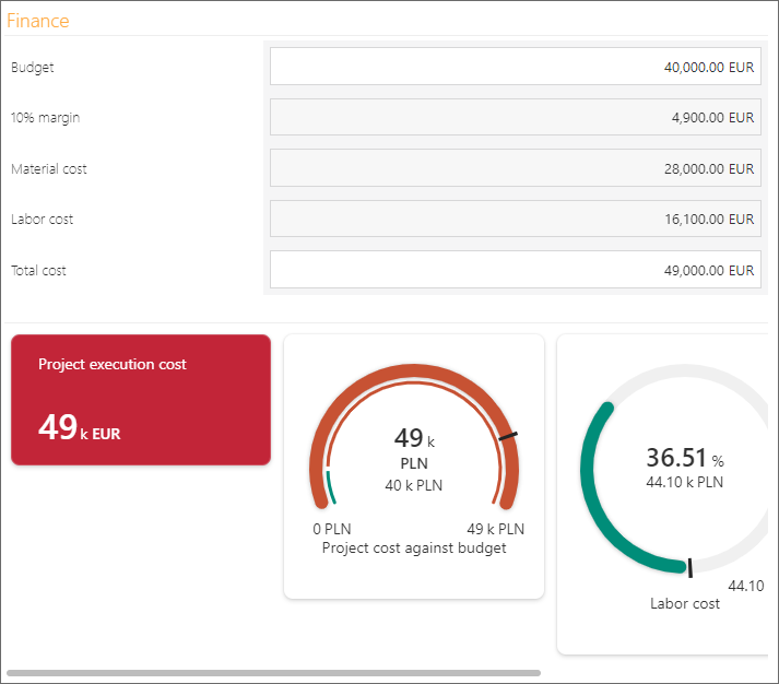
Four Widgets placed within a group in a horizontal arrangement - No Wrap
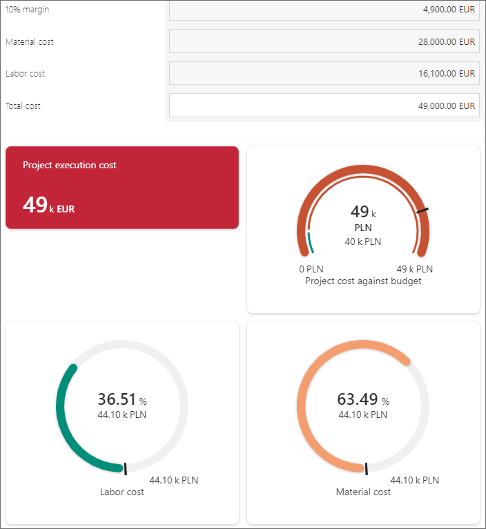
Four Widgets placed within a group in a horizontal arrangement - With Wrap
Tracing progress
Great news: the investor has accepted the offer! Behind closed doors, people say the visually appealing presentation sealed the deal… The project has been running for two months.
Thanks to the “Projects” application, field workers report progress using the WEBCON BPS mobile app by checking off their respective tasks on a dedicated Item list. The number of tasks is considerable, and to be honest, the Head of the Department accessing the application knows very little about technical matters… Perhaps that is why they keep complaining about the lengthy and overly detailed list. Let’s simplify this task for them by using a new type of Widget: the Progress bar.
Create an additional widget named "Progress in project execution," select the Progress bar type, and proceed to its configuration. In the Displayed value field (under the General tab), enter the "Number of executed man-hours". The form field indicates the number of man-hours assigned to a particular task (marked as "Done" on the Item list). In the Expected value field, enter the "Number of man-hours" (the form field value is calculated using the SUM function, aggregating the number of man-hours from the respective column of the Item list). Define the Widget's colors and select the Show color scale checkbox.
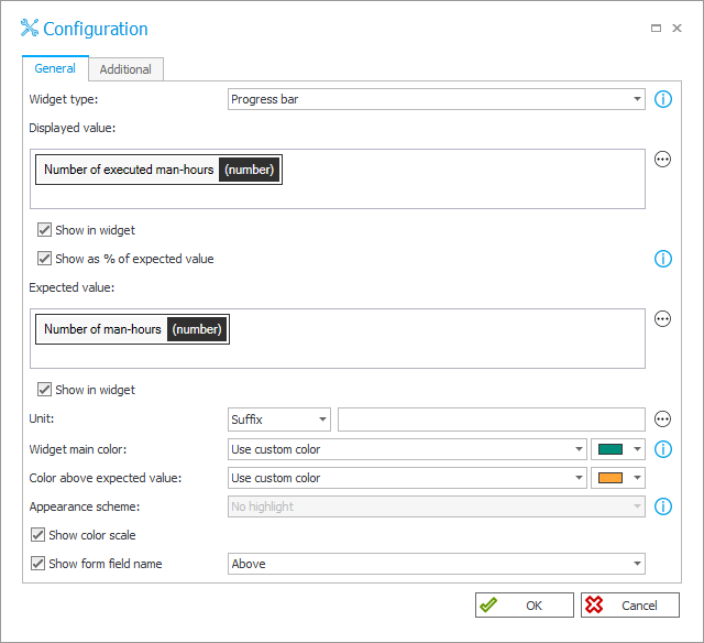
A demonstrative configuration of the "Progress in project execution" Widget.
According to the standard contractual provisions for individual investors, exceeding the agreed project schedule by one month (20 work days × 8 man-hours) results in contractual penalties. Therefore, in the Maximum value field, enter a simple rule that adds the value "160" to the "Number of man-hours" form field variable.
Next, select the Additional coloring conditions checkbox and define four conditions. For each condition, set the Threshold type to "Percentage" and the Basis to "Expected value". Enter 25%, 50%, 75%, and 100%, respectively. Then, define the colors for the additional thresholds.
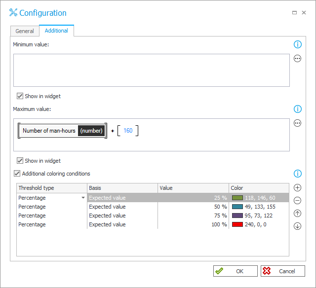
The configuration of Maximum value and Additional coloring conditions.
After saving the configuration, proceed to Portal. As shown in the image below, the defined Progress bar allows users to conveniently track progress and take action if the project execution is prolonged.
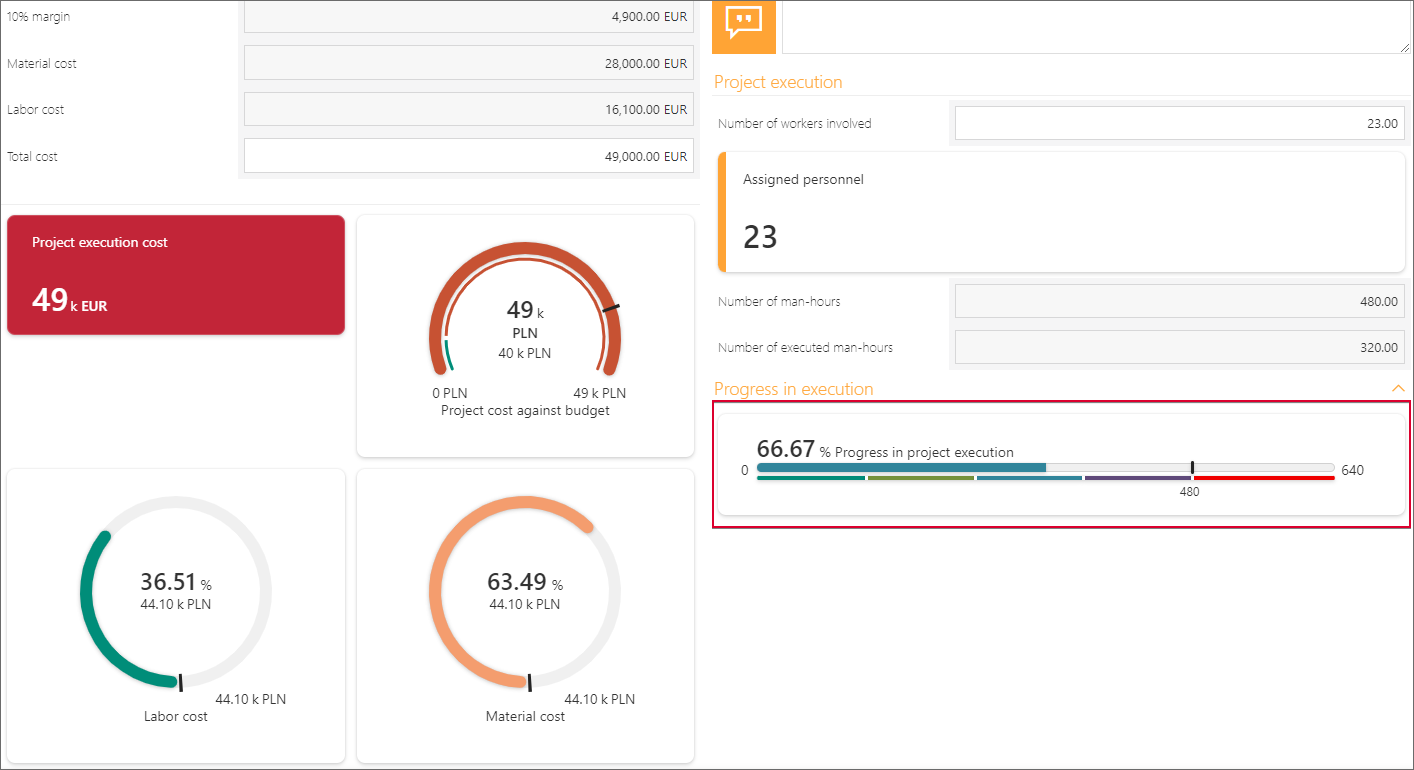
The final form includes added Widgets, including the Progress bar Widget, which enables users to track progress in project execution. Please note the scale split into different colors representing value ranges.
Summary
Thanks to the Widget form fields, users can quickly access key data and information. Therefore, well-configured and well-designed widgets facilitate data analysis by presenting only the relevant information in a given situation, which can contribute to making important decisions faster.
Finally, it is also important to emphasize the aesthetical aspect: just as a beautifully presented meal enhances its appeal, the visual presentation of data can significantly impact its perceived value and effectiveness.

