Dear WEBCON Team,
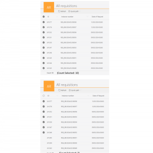
currently in reports, the total number of entries is always displayed even when selecting certain entries.
Is it possible to add another counting function to see below "count all" and "count selected" entries?
Another improvement would be to enable selection across mutiple report pages.
Can this be enabled?
Best Regards,
Lena
Show the actual count of selected entries in reports NOT NOW
Hi Lena, could you please describe what is the business case behind your request? I understand the technical side of it, I'd like to understand more the impact on the end-users.
Hi Lena, could you please describe what is the business case behind your request? I understand the technical side of it, I'd like to understand more the impact on the end-users.
Hi Michal,
Thank you so much for your answer!
This function would make it clear how many records are selected and allow the end user to know at a glance how many records are actually selected.
This would reduce the risk of forgetting a record and provides a better overview of the report.
So for me, the optimal solution would be to display another count (in brackets) with the selected records next to the total count.
BR
Lena
I see. From the technical and UX perspective there's one challenge related to the placement of such information. Since every column on our reports can have an additional value below (like sum, average, etc.), the placement you suggested on the screenshot is already reserved for those values.
At the same time, most of our clients use pagination, which would limit the number of displayed rows. Therefore they're easier to manage for every user.
With that said, I can promise that if the request for such functionality is repeated by others, we'll have a closer look at the implementation possibilities.
Thank you for the fast answers!
I understand that and look forward to this.


