Hello everyone,
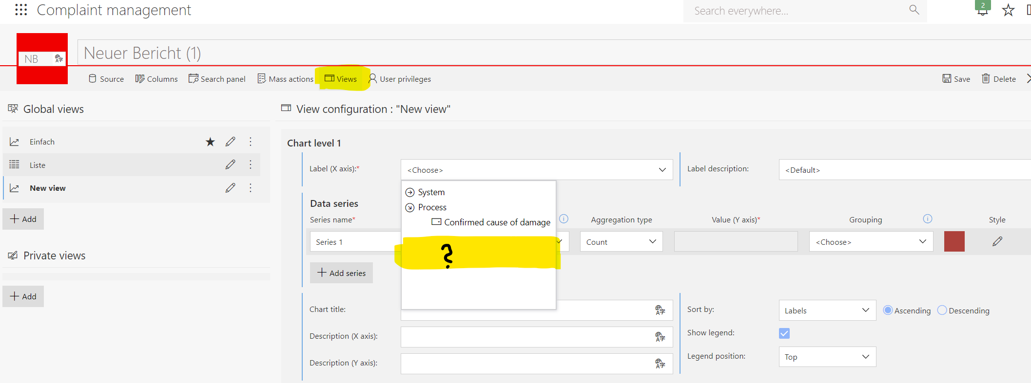
I'm trying to create an article-based analysis. The evaluation should list how often an item is affected in a complaint.
Unfortunately, although I can add the corresponding fields as columns for a list view, I cannot display them in the form of a chart.
Why do these fields have the blue text [Positions] in front? What is it about these elements that I cannot select them in the view page as an element to be displayed (Image 2)?
Many thanks in advance.
Greetings,
Matthias