Home > Forum > General > WEBCON 2025 Changelog / Release Notes - What's your favourite?

WEBCON 2025 Changelog / Release Notes - What's your favourite?
0

MVP

As 2025 version have been released, we've got a new changelog to read through: https://webcon.com/wp-content/uploads/2024/11/Changelog_2025_1_1_23_EN.pdf

What are your thoughts on changes? Which ones are yours favourite? :)

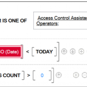
For me - ALL TRUE, and ANY TRUE operators sounds great! So many nested boolean logic to update ;)

There's no accounting for taste, but opinions can be expressed. I've just finished my first cursory tests of the new version of webcon 2025. While I've received every new version relatively positively so far, this 2025 is a misunderstanding. It's a failure. It shouldn't even have made it out of the alpha stage. There are so many bugs and inconsistencies in the new look of the user interface that I don't even feel like writing about all the flaws (I'm not paid for tests :) ). Everyone has to experience it for themselves, but to sum up... a good product has been plowed under. You've put your fingers in something you shouldn't have changed. You don't change a good horse when it's winning.


(everything without CSS customizations - I haven't used them so far so it should be ok but it's not)
- mobile app incorrectly displays the interface in many places
- mobile app inconsistent UI
- portal inconsistent UI
- portal errors in UI display
- portal - subjectively changing themes for the worse, the controls used take up too much space while the UI designer wastes space is some place, most things are spread out, UI changed a lot which will be a pain in the ass for the end user - since the admin has a hard time finding his way around here :)

+ mostly trouble-free update


many things from the changelog have not been checked yet and I will probably give up and go back to the well-known and stable version 24. Maybe I will wait for a year until it has some value.

MVP

If I have to name one favorite than it's the form rules to determine the visibility of item list row actions, while the phases and actors are just behind.

But it's really hard there are many interesting changes.
Therefore I put together an "excerpt" which is of course subjective. :)
https://daniels-notes.de/posts/2024/webcon-bps-2025-change-log


@Mansoft
The first version of anything will always have some flaws, but we need to start somewhere. Of course, you are free to wait until those are addressed, but if you don't want to mention them, then some of those may get unnoticed and they will still be there, when you test it the next time.

But I have to comment on this "You've put your fingers in something you shouldn't have changed. You don't change a good horse when it's winning."
This is your subjective impression as a WEBCON user. As a partner I can offer a little more "objective" feedback. During the last year we got a regular comments regarding the (out)dated UI. This even forced us to create our own theme, which we can now get rid of / need to review. Yes, existing users will have to get comfortable with the new UI and I agree that a the screen "real estate" has been reduced even further, but a change had to come. At some point you need to switch to a fresh horse, even if it hasn't has any race experience yet. The old one was slowly but steadily dying.

In reply to: Daniel Krüger (Cosmo Consult)

If I have to name one favorite than it's the form rules to determine the visibility of item list row actions, while the phases and actors are just behind.

But it's really hard there are many interesting changes.
Therefore I put together an "excerpt" which is of course subjective. :)
https://daniels-notes.de/posts/2024/webcon-bps-2025-change-log


@Mansoft
The first version of anything will always have some flaws, but we need to start somewhere. Of course, you are free to wait until those are addressed, but if you don't want to mention them, then some of those may get unnoticed and they will still be there, when you test it the next time.

But I have to comment on this "You've put your fingers in something you shouldn't have changed. You don't change a good horse when it's winning."
This is your subjective impression as a WEBCON user. As a partner I can offer a little more "objective" feedback. During the last year we got a regular comments regarding the (out)dated UI. This even forced us to create our own theme, which we can now get rid of / need to review. Yes, existing users will have to get comfortable with the new UI and I agree that a the screen "real estate" has been reduced even further, but a change had to come. At some point you need to switch to a fresh horse, even if it hasn't has any race experience yet. The old one was slowly but steadily dying.

I don't know why your opinion should be more objective than mine. IMO. For each of us both opinions are subjective (and mine is additionally not dictated only by the end user, as a non-partner you can maintain and administer this system for end users and often do so to a much greater extent than partners within strictly defined provisions of agreements) but never mind that.

I am open to changes but from a product like WEBCON I expect above all:
- stability
- bug free (if possible)
- a proven and TESTED product and not a product given to the user or partner to look for errors in accordance with... they will report it to us then we will fix it, we will cut costs and we will not attach too much importance to quality.
- maintaining some minimum compatibility (I really don't like the action with themes - we changed the theme, we informed you and accept it or take the costs of its correction and improvement as part of our update). Theme is just one example of how certain "costs" are passed on to the customer as part of "ensuring updates" that the customer already pays for.

Let's not kid ourselves, the product is not cheap, the product is quite good overall, but the larger the corporation and the more customers, the worse it treats them and the product itself.

Critical opinion, but I know my own stuff and not only based on experience with webcon.
You can also introduce changes in smaller steps but refine them more. Here we have rather a total overturning of the table.


Update (thought):
I assume that as an mvp you have a somewhat limited scope for negative statements on the subject of WEBCON.

Besides, I also know perfectly well what the provisions of partnership agreements are. So if you want to talk about the OBJECTIVITY of your statements in relation to mine, it looks bad against the background of your profile :]

PS. Of course, full respect for your knowledge and experience as well as the help you provide, without which I would have failed many times :)

In reply to: MANSOFT

I don't know why your opinion should be more objective than mine. IMO. For each of us both opinions are subjective (and mine is additionally not dictated only by the end user, as a non-partner you can maintain and administer this system for end users and often do so to a much greater extent than partners within strictly defined provisions of agreements) but never mind that.

I am open to changes but from a product like WEBCON I expect above all:
- stability
- bug free (if possible)
- a proven and TESTED product and not a product given to the user or partner to look for errors in accordance with... they will report it to us then we will fix it, we will cut costs and we will not attach too much importance to quality.
- maintaining some minimum compatibility (I really don't like the action with themes - we changed the theme, we informed you and accept it or take the costs of its correction and improvement as part of our update). Theme is just one example of how certain "costs" are passed on to the customer as part of "ensuring updates" that the customer already pays for.

Let's not kid ourselves, the product is not cheap, the product is quite good overall, but the larger the corporation and the more customers, the worse it treats them and the product itself.

Critical opinion, but I know my own stuff and not only based on experience with webcon.
You can also introduce changes in smaller steps but refine them more. Here we have rather a total overturning of the table.


Update (thought):
I assume that as an mvp you have a somewhat limited scope for negative statements on the subject of WEBCON.

Besides, I also know perfectly well what the provisions of partnership agreements are. So if you want to talk about the OBJECTIVITY of your statements in relation to mine, it looks bad against the background of your profile :]

PS. Of course, full respect for your knowledge and experience as well as the help you provide, without which I would have failed many times :)

https://www.youtube.com/playlist?list=PL-xscdmsg7YonDzQM-9Aix0Yfzak5LlN1
(for the new version there is no, so the manufacturer includes instructional materials in the new 2025 version referring to the old version and the old interface... great!)

When I look at these fresh (3m) video materials and the current version, it brings tears to my eyes how this interface was screwed up in the new version..
It was so clean, clear, CLEAR, subdued, refined to the smallest detail. From a distance, you could tell what was where and how

Remember, most people are visual and "buy" with their eyes.
I personally don't know how to work with the new interface because it hurts the eyes regardless of the dark/light theme.


So I'm looking through this and thinking to myself that, damn it, they could have made a theme based on the new UI components with the name WEBCON (OLD) 2024 and at least kept the component colors as consistent as possible with the previous release.

MVP
In reply to: MANSOFT

I don't know why your opinion should be more objective than mine. IMO. For each of us both opinions are subjective (and mine is additionally not dictated only by the end user, as a non-partner you can maintain and administer this system for end users and often do so to a much greater extent than partners within strictly defined provisions of agreements) but never mind that.

I am open to changes but from a product like WEBCON I expect above all:
- stability
- bug free (if possible)
- a proven and TESTED product and not a product given to the user or partner to look for errors in accordance with... they will report it to us then we will fix it, we will cut costs and we will not attach too much importance to quality.
- maintaining some minimum compatibility (I really don't like the action with themes - we changed the theme, we informed you and accept it or take the costs of its correction and improvement as part of our update). Theme is just one example of how certain "costs" are passed on to the customer as part of "ensuring updates" that the customer already pays for.

Let's not kid ourselves, the product is not cheap, the product is quite good overall, but the larger the corporation and the more customers, the worse it treats them and the product itself.

Critical opinion, but I know my own stuff and not only based on experience with webcon.
You can also introduce changes in smaller steps but refine them more. Here we have rather a total overturning of the table.


Update (thought):
I assume that as an mvp you have a somewhat limited scope for negative statements on the subject of WEBCON.

Besides, I also know perfectly well what the provisions of partnership agreements are. So if you want to talk about the OBJECTIVITY of your statements in relation to mine, it looks bad against the background of your profile :]

PS. Of course, full respect for your knowledge and experience as well as the help you provide, without which I would have failed many times :)

I'm sorry that I did not get across the reason, why I used "objective".
I used this word, not because we are a partner, because we already spend hours to modify the UI because we received numerous negative feedback. So, I used "objective" in quotes from a quantity perspective.

That's the only reason I used this word. Even if this my sound strange, but I wouldn't have minded keeping the old "UI" alive. I'm more focused on functionality than "looking pretty". Which I heard complains about more often than not. :)

I'm also experimenting with a "full screen" functionality at the moment because I don't like how much space get's lost, which I also voiced using another communication channel. So, yes while I'm definitely biased I also point out flaws or things I don't understand.

Quote from my blog post about the change log of 2025:
New Workflow designer
"Hidden no longer means hidden :( At least in this version, let’s cross our fingers."

While I agree with some of the mentioned issues, I haven't verified others, at some point a version needs to be released. This is also something everyone of us here propagates when building new processes/applications. Create the first working version, and build up on it afterwards.

Off topic:
I have the feeling that suggestions from customers are more likely to be heard than those of partners. We don't pay the bill. This is also something I voiced in some discussions and I never got a response. So I may be right. :)

In reply to: Daniel Krüger (Cosmo Consult)

I'm sorry that I did not get across the reason, why I used "objective".
I used this word, not because we are a partner, because we already spend hours to modify the UI because we received numerous negative feedback. So, I used "objective" in quotes from a quantity perspective.

That's the only reason I used this word. Even if this my sound strange, but I wouldn't have minded keeping the old "UI" alive. I'm more focused on functionality than "looking pretty". Which I heard complains about more often than not. :)

I'm also experimenting with a "full screen" functionality at the moment because I don't like how much space get's lost, which I also voiced using another communication channel. So, yes while I'm definitely biased I also point out flaws or things I don't understand.

Quote from my blog post about the change log of 2025:
New Workflow designer
"Hidden no longer means hidden :( At least in this version, let’s cross our fingers."

While I agree with some of the mentioned issues, I haven't verified others, at some point a version needs to be released. This is also something everyone of us here propagates when building new processes/applications. Create the first working version, and build up on it afterwards.

Off topic:
I have the feeling that suggestions from customers are more likely to be heard than those of partners. We don't pay the bill. This is also something I voiced in some discussions and I never got a response. So I may be right. :)

I mostly agree. I feel almost the same way.

PS.
Customer voice.... || wall || Partner || wall || Software manufacturer with a thousand walls along the way ... :) that's all on the subject

MVP
In reply to: MANSOFT

I mostly agree. I feel almost the same way.

PS.
Customer voice.... || wall || Partner || wall || Software manufacturer with a thousand walls along the way ... :) that's all on the subject

I will also only add one comment, because I asked someone via LinkedIn, what's his opinion:

Quote: "
My Boss is delighted, i updated my personal dev
a lot more possibilities to create more modern start pages for apps

like it also as we all working on office365 and design is familiar
i showed it to my friend and he told me that it looks almost like dynamics 365 :)

"

@All
After Mansoft and I went off topic, please focus on Maks question. :)

Dear Maks,
Thank you for sharing these ideas; they both look very promising.
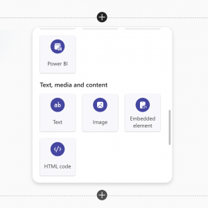
Personally, I believe the simpler features also hold significant value, such as adding more content options on the application page—like text blocks, graphics, embedded elements, or HTML code.
These additions could enhance flexibility and improve user engagement.

MVP
In reply to: Adam Hatak

Dear Maks,
Thank you for sharing these ideas; they both look very promising.
Personally, I believe the simpler features also hold significant value, such as adding more content options on the application page—like text blocks, graphics, embedded elements, or HTML code.
These additions could enhance flexibility and improve user engagement.

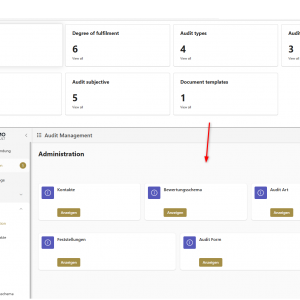
I would also add to this the new possibilities for customizing the menu and the dashboard filters. Although the new way, from a dev perspective, may seem a little more confusing at first, it now allows for a much more intuitive and friendly UI/UX.

The new functionalities have added some complexity for the developers but much more flexibility for the customer's needs. It's way easier as a dev to screw it up, but if done properly the customer will end up with better results. We need to revise our internal development processes and practices now, but if we can offer more value, we don't mind.

MVP
In reply to: Razvan Ogrezeanu - ENCORSA Romania

I would also add to this the new possibilities for customizing the menu and the dashboard filters. Although the new way, from a dev perspective, may seem a little more confusing at first, it now allows for a much more intuitive and friendly UI/UX.

The new functionalities have added some complexity for the developers but much more flexibility for the customer's needs. It's way easier as a dev to screw it up, but if done properly the customer will end up with better results. We need to revise our internal development processes and practices now, but if we can offer more value, we don't mind.

I have to agree that Dashboard level filters are something that i've been really missing (I've some experience with Tableau where it is an obvious feature).
It closes the gap to BI system, and allows to achieve more in WEBCON itself which is great for smaller companies not having BI tools.

On the UI change offtopic though - I get why many people might be upset about it, especially when applications have a lot of UI customizations.
This is why i always try to avoid it as much as possible - it's the platform that decides how things should look, we are paying for not having to deal with it.
UI / UX designers should deal with it, and delivering Fluent 2 designed by Microsoft is from my perspective really smart, as it aligns perfectly with Windows 11 UI, and all the Office apps stack which is still default in most corporations.

MVP
In reply to: Razvan Ogrezeanu - ENCORSA Romania

I would also add to this the new possibilities for customizing the menu and the dashboard filters. Although the new way, from a dev perspective, may seem a little more confusing at first, it now allows for a much more intuitive and friendly UI/UX.

The new functionalities have added some complexity for the developers but much more flexibility for the customer's needs. It's way easier as a dev to screw it up, but if done properly the customer will end up with better results. We need to revise our internal development processes and practices now, but if we can offer more value, we don't mind.

@Adam
The elements you mentioned have "always" been there. I mention this just in case you need to use them in an older version. ;)


Yes the new options we have to define in the navigation is really great.
I added my first idea for "migrating" to the new one. Maybe we can share our ideas regarding a good "default" navigation structure. As Razvan mentioned, we need to define new guidelines now and a joint effort may help everyone.
Regarding the navigation grid: There's currently an issue with the translation, old ones may get lost, if you update the translation of a single element.

I also like the the option to define multilingual texts on the dashboards. Another workaround we can now scrap. :)