Form field appearance on the MODERN form
Applies to version: 2020.1.x and above; author: Mateusz Klos
WEBCON BPS Designer Studio allows you to configure the form fields’ appearance so that they can be more transparent and legible, as well as tailored to your users’ preferences. The following article lists several ideas on how to manage the appearance of your form fields:
Groups
Through WEBCON BPS Designer Studio, we have the ability of grouping the form fields into thematic or visually consistent groups, and by configuring them we can manage the following properties:
- The first field allows you to select if the group name will be displayed above them or not. In the second case the group will be separated from the rest of the form fields by using a horizontal solid line.
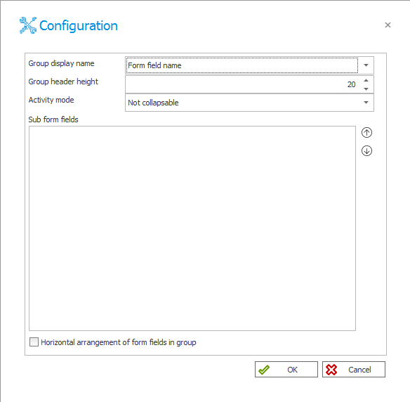
Fig. 1. Configuration of the group view
- When the user decides to set a name as visible, the “Group header height” option allows you to select the distance of the text (in pixels) from the line separating them from the form fields inside.
- In the “Sub form fields” section you can change the display position of the form fields in the group by using the arrows.
- Checking the box at the bottom of the window allows you to display elements horizontally. This option works for maximum of three form fields. When there are more – they will be displayed traditionally (vertically).
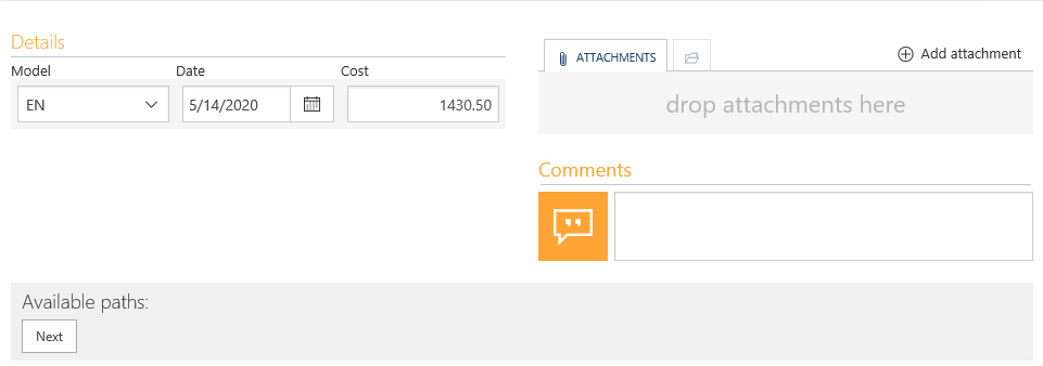
Fig. 2. Horizontal layout of form fields in a group
Multiple lines of text
A WEBCON BPS user by managing the “multiple lines of text” option will receive lots of options to manage the form field appearance, after clicking the “Advanced configuration” option:
- The first of them is to select the number of rows which will be displayed on the form (the maximum number of possible characters do not change)
- The next thing is to select the editor type – the standard and rich mode. Selecting the first one allows you to operate the standard text, while after selecting the rich editor, the “Advanced” tab is activated we can decide what formatting options will be available to the user. A user can then select and use these formatting options when they are filling out the form field on the form. Also, there are available three predefined tools sets differing in the number of formatting types selected.
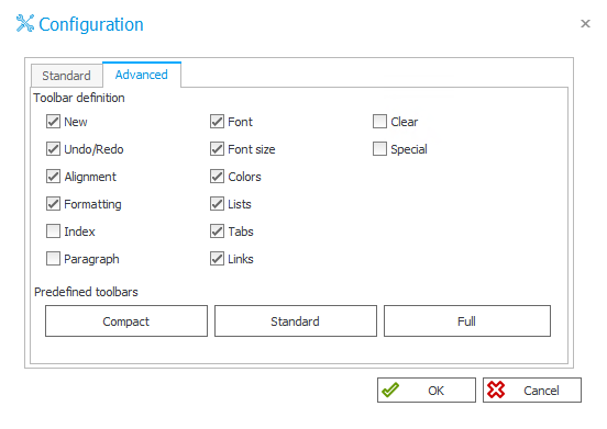
Fig. 3. The configuration of formatted editor type
- Below, in the “Standard” tab there is the “Append mode” which allows you to add a message below the text field with the date of saving and author’s comment. The entries added in this way cannot be edited later.
- The last option to select is the position of the text field name, where the user can select whether the name is next to (default setting) or above the field. Below there is a comparison of these two otpions:

Rys. 4. The name next to the text field

Fig. 5. The name above the text field
Data row
In the “Advanced configuration” of these form field, we manage the way of displaying the selected columns. Next to the “Display name” header there are new options do select:
- Indicator field – displays the numerical value in the form of an icon with different colors:
- by less than or equal to 0 – red
- by a value of 1 – yellow
- by a value greater than 1 – green
- Percent field – a numerical value will be displayed as a progress bar in the percentage mode. Selecting this field is recommended when you operate with numbers in the range of 0-100
- Bold field – a value is displayed in bold
- Show column – the user decides if the column will be displayed
- Instance hyperlink – after clicking on the given element, a preview window will appear with the hyperlink. For such marked fields, specify which value is the ID of the linked field. This menu is available after clicking the icon with three dots on the right.
At the bottom there are two checkboxes responsible for displaying column names and enabling empty values in the data source. The second field, when checked, will allow the use of variables that return an empty value. When the option is deselected and the variable used in the query returns an empty value, the records will not be displayed.
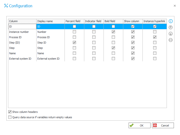
Fig. 6. The configuration of the “Data row” form field
Survey fields – rating scale
The configuration is divided into three parts:
- Question – in the “Text” field the user fills in the comment or question that appears when selecting the grade. Then select whether the question should be appeared on the side or above the choice of grade.
- Scale values – the “Minimum” and “Maximum” fields are used to set the range of the rating scale (from 0 to 10)
- Description of values on the scale – should be completed with the text that will be displayed at the minimum and maximum value
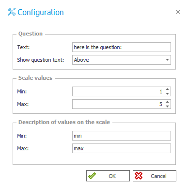
Fig. 7. The advanced configuration of the “Scale rate” field
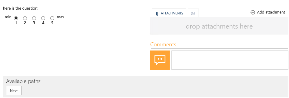
Fig. 8. The form field view in the Portal
Survey fields – choice list
This form field allows you to select one (or more) answer of the following options:
- The user creates a question and the place where they will be displayed.
- The “Answers” section is used to manage options to select. By using the buttons on the right, the user can add, edit, delete and also change the order in which responses are displayed. Below you should select the numbering method – numerically (1,2,3…) or alphabetically (a,b,c…).
- Below, by selecting the “Multichoice” option there is the ability of selecting multiple options. However, selecting the next “Show field to type answer” option a new answer is displayed, but this time with the option to enter their in the text field that appears below it. The user can also define the number of rows that the field will be contained.
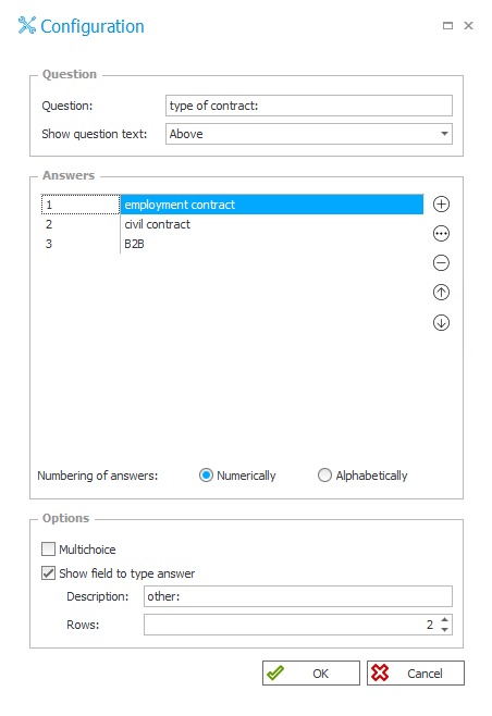
Fig. 9. The configuration of the “Choice list” form field
The form field style
WEBCON BPS Designer Studio allows you also to customize the form fields style by using the cascading style sheets language (CSS). To do this, go to the “Style and behavior” tab and in the “Style” section there are two fields allow for formatting the content by using the CSS properties:
- Field name style – the user can configure the label appearance. After filling in with an example condition changing the color and font size – the name looks like this:
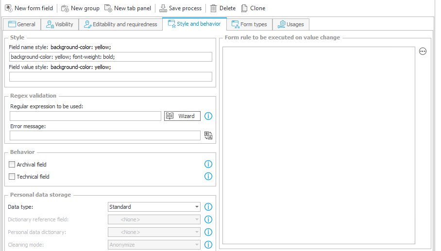
Fig. 10. Filling in the field by using the CSS properties

Fig. 11. The result of changing the field name style
- Field value style – a field responsible for form field control appearance (in this case – multiple text). In this example we entered the color in hexadecimal code.
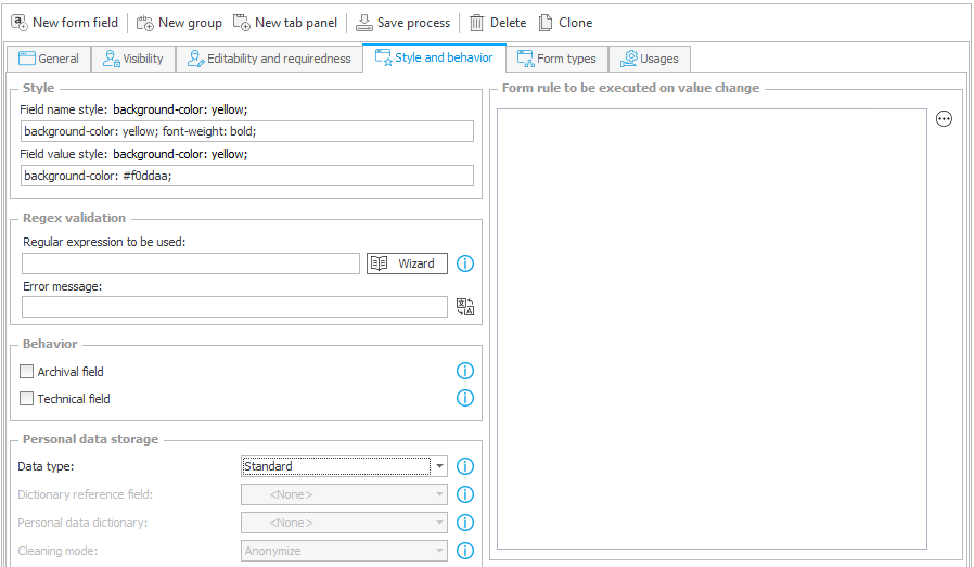
Fig. 12. Filling in the “Field value style” field

Fig. 13. The result of action

