In reply to: Paweł Drab (WEBCON)
Dear Daniel,
great idea and clever workaround - as always :-) Thank you for that!
Instead of the indicator icons, you can use UI Fabric ones: https://community.webcon.com/community.webcon.com/public/posts/post/advanced-cell-coloring-in-reports/18
SQL query used in traffic lights customization is more flexible than report icons. UI Fabric can be used only for simple filters, the ones based on variables:
- DET – process
- STP – step
- DOCTYPE – form type
- SUBDOCTYPE – sub-type form
- WF – workflow
I finally took the time to play around with the advanced formatting options. Using these and applying the styling options from this thread
https://community.webcon.com/forum/thread/41/15
I got a nice uniform solution for reports and data tables.
____Form____
--Calculated field in BPS internal data view
(case
when WFD_IsFinish = 1 then '<i class="finished-Icon ms-Icon" title="Completed."/>'
....
end)
--Styling:
.finished-Icon::before{
content:"\E73E";/* CheckMark icon*/
font-size:large;
font-weight:bold;
color:green;
}
____Report____
Calculated field returns the icon class from https://uifabricicons.azurewebsites.net/
{
"$schema": "http://developer.webcon.com/json-schemas/v1/column-formatting.schema.json",
"children": [
{
"element": "span",
"content": " ",
"attributes": {
"iconName": "=CurrentField",
"title": "=if(CurrentField=='Warning','Overdue',if(CurrentField=='AlarmClock','Due in less than two days',if(CurrentField=='BufferTimeAfter','Due in less than ten days.',if(CurrentField=='DateTime2','More than ten days until due.','Completed'))))"
},
"style": {
"color": "=if(CurrentField=='Warning','red',if(CurrentField=='AlarmClock','orange',if(CurrentField=='BufferTimeAfter','orange',if(CurrentField=='DateTime2','blue','green'))))",
"font-size": "large",
"font-weight": "bold",
"white-space": "pre"
}
},
{
"element": "span",
"content": " ",
"attributes": {
"title": "=if(CurrentField=='Warning','Overdue',if(CurrentField=='AlarmClock','Due in less than two days',if(CurrentField=='BufferTimeAfter','Due in less than ten days.',if(CurrentField=='DateTime2','More than ten days until due.','Completed'))))"
},
"style": {
"white-space": "pre"
}
}
]
}
-- Remark 1
The referenced fabric ui site contains more icons than are available. We can not use DateTime12 for example.
-- Remark 2
iconName will generate an html element like this
<i class="icon ms-Icon ms-Icon--CheckMark" aria-hidden="true" title=""></i>
Because of title="" in this element the title of the parent element is not displayed on mouse over. Therefore I surrounded the i tag with spaces to display the tooltip, if the mouse is a little bit outside the icon itself.
Creating a multilingual tooltip in the report will get even uglier. Since we don't have the language we would need to multiply the if conditions for each additional language.
if(Icon1-EN, english Text, if(Icon1-DE,german text ...
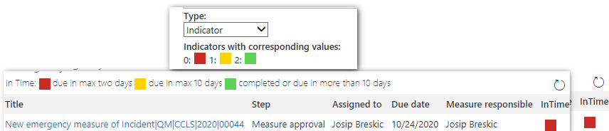
While it's great to have these options and it was an interesting experiment I still believe, that the initial suggestions for the indicator would make life a lot easier. Even if we would be limited two three colours:)