Choice field types
Applies to version: 2021.1.x and above; author: Adrian Baszak
WEBCON BPS offers several choice field types that differ in their functionalities and behavior on the form. We distinguish three choice field modes: drop-down list, choice field with a search option (a.k.a. Search window), and autocomplete. This article discusses the operating mode of the choice field type, types of choice fields in item lists (a.k.a. choice columns), the person type or group field type as well as the differences between the form fields presented above.
Tab.1 Comparison table with choice field types
|
Mode |
Drop-down list |
Autocomplete |
Choice field with a search option |
|
Value search
|
|
+ |
+ |
|
Selection of several values |
|
+ |
+ |
|
Entering values into dependent fields (i.e. “Target field” function)
|
|
+ |
+ |
|
Adding new values to the source |
|
+ |
+ |
|
Adding non-existing values |
+ |
|
|
|
Translating values
|
+ |
+ |
+ |
|
Operating with data sources |
+ |
+ |
+ |
Above you can find a comparison table (Tab.1) that presents three operating modes of the choice field. The table shows that the autocomplete mode and choice field with a search option mode give more possibilities than the drop-down list.
Later in the article the respective functionalities set out in the table will be discussed.
The layout of all choice fields is given below (Fig.1).

Fig. 1 Choice field type displayed in the form
Drop-down List
“Choice List” is the simplest solution for using the choice field. It allows for selecting a single value from the given list. However, it cannot be employed for setting values in dependent fields and also lacks a search option. This type of solution applies to a simple list with several values (e.g., select yes/no or priority: low, standard, high, critical).
Fig.3. illustrates the configuration of a drop-down list.
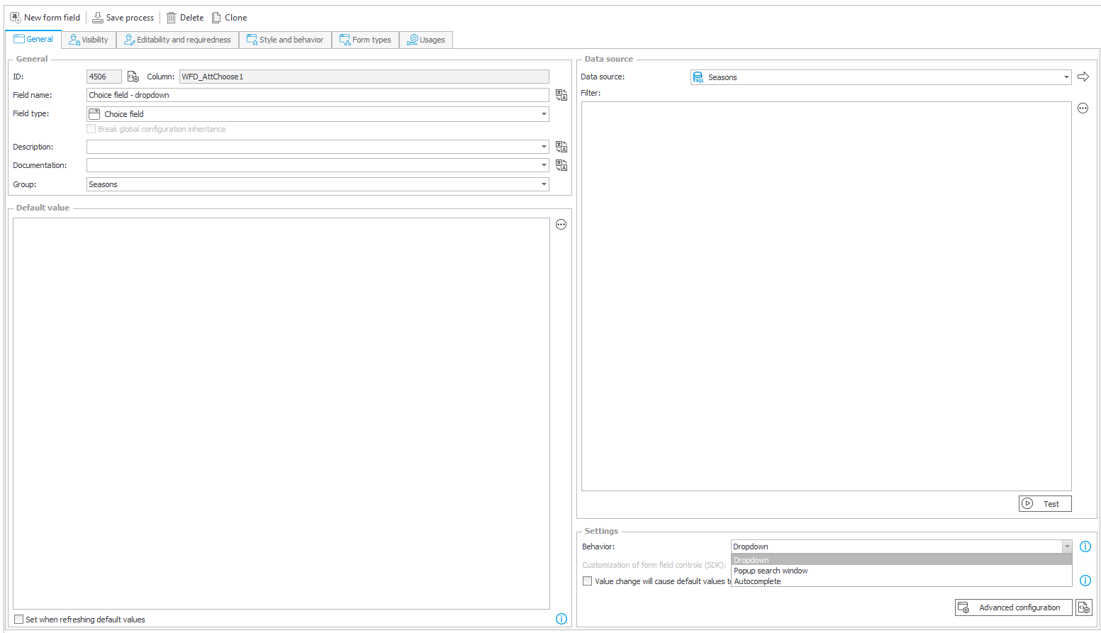
Fig. 2 Example of the drop-down list configuration
The operating mode of the choice field can be selected in the “Settings” section, in the “Operating Mode” field.
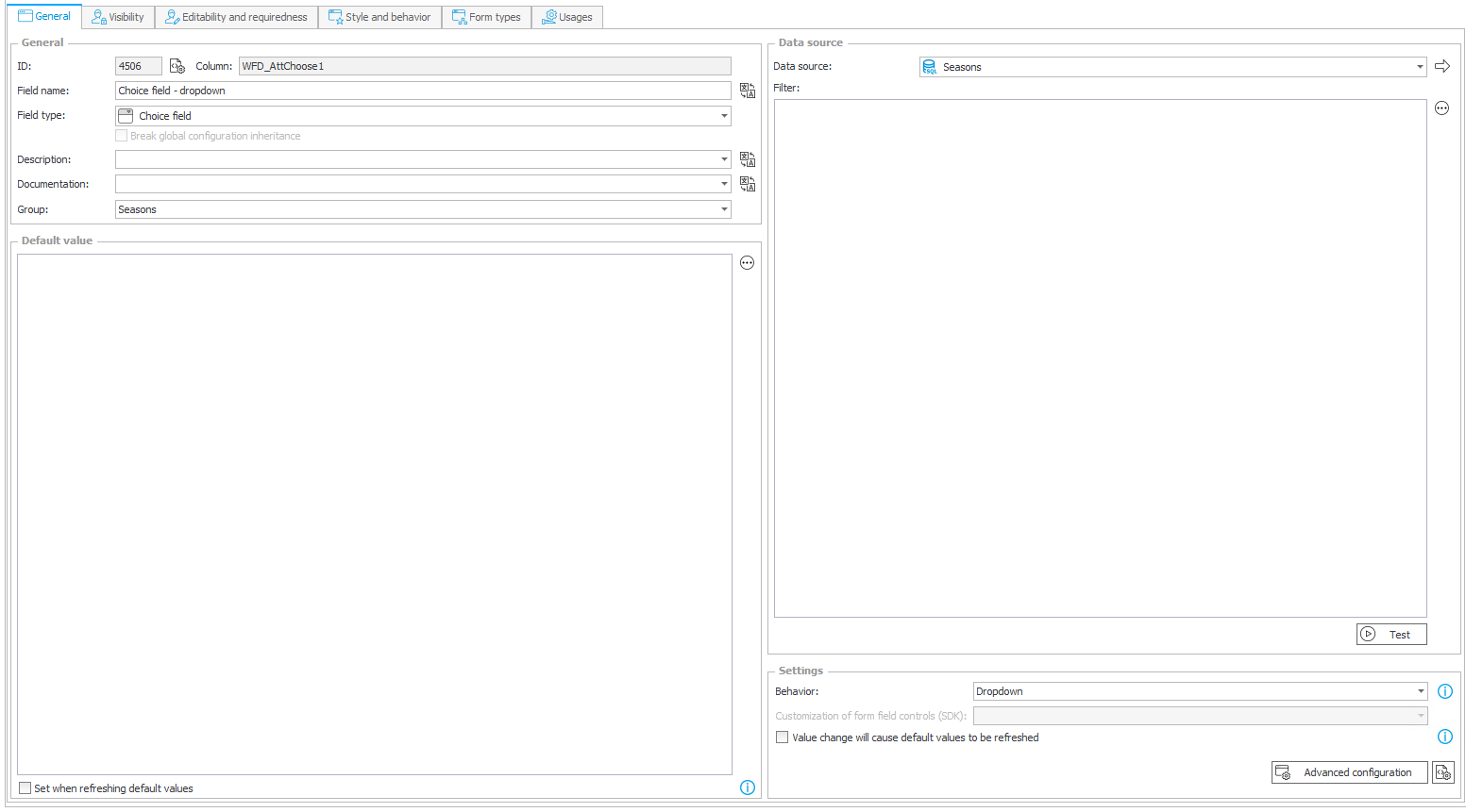
Fig. 3 Example of the drop-down list advanced configuration
In the advanced configuration of a drop-down list only the “General” tab is available. The configuration of field columns entails selection of a source column and definition of a text display. One can edit all values set out in the “Display Text” column and provide translations thereof.
Despite indicating several columns (Fig. 4), in the drop-down list only the “Season of the year” column will be displayed (Fig. 5).
By activating “Query data source if variables return empty values” checkbox one can decide whether to set an Empty element display name – placeholder text introduced in this field will be displayed when no value is selected.
By activating “Allow selecting values no longer available in the data source” checkbox one can decide whether the data selected in the choice field, which later will be deleted from the data source, should remain as the values selected in the choice field.
By activating “Support multi language names” checkbox one can display in the choice list the translated items, depending on the selected language in the Portal. In such case, it is necessary for the data source to contain information about translations, in the following format: Przedwiośnie$$EN$$Eve of the spring.

Fig. 4 Drop-down list -advanced configuration
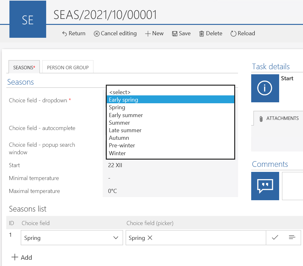
Fig. 5 Drop-down List choice field
Autocomplete
The advanced configuration of the autocomplete field is shown in Fig. 6.
In the configuration of the form field discussed one can indicate the line of the data source that should be taken into account during a search – the “Search” column and the “Show in Dialogue” column. In the “Target Field” one can indicate dependent fields that will be filled in with the values from said columns. For example, according to the configuration discussed, the values from the Tmin source column will be introduced to the “ Minimum temperature” field.
When marking the “Allow multiple values” checkbox, in a single choice field several values can be chosen.
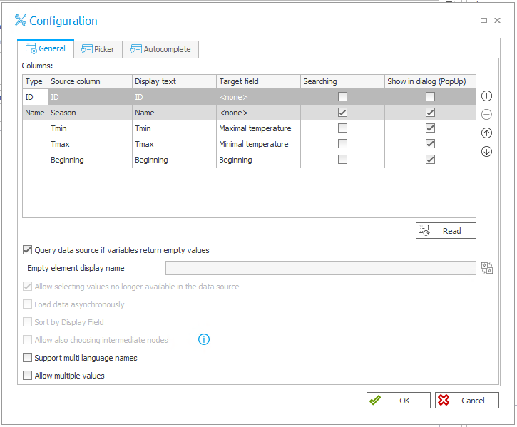
Fig. 6 Autocomplete - advanced configuration
In the advanced configuration in the “Picker” tab one can select the search mode of the choice field.
By activating “Allow for adding values not in the data source” checkbox one can decide whether with the use of the choice field an item can be entered manually and after saving the form it will be added to the data source. When marking the abovementioned checkbox, in "Additional link" one can introduce a link leading to the form of adding a new value to the choice field data source.
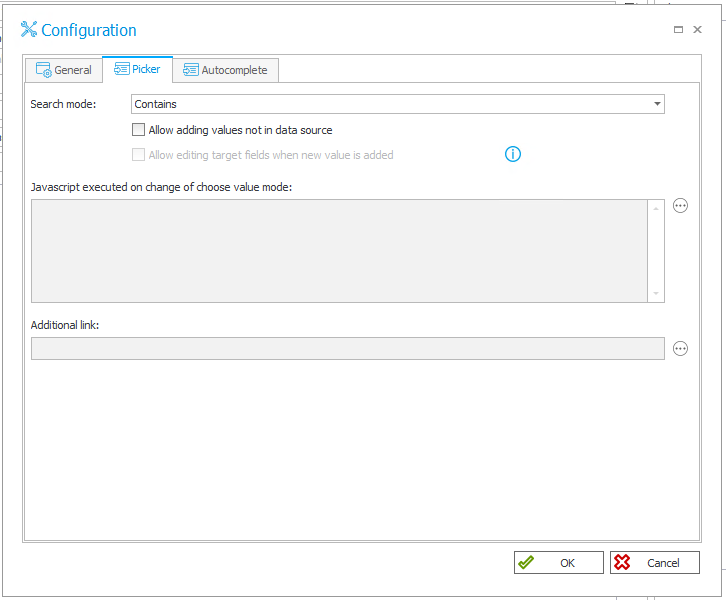
Fig. 7 Picker tab in the advanced configuration of the autocomplete form field
In the “Autocomplete” tab one can see the settings for hints of the results that fit the values from the choice field.
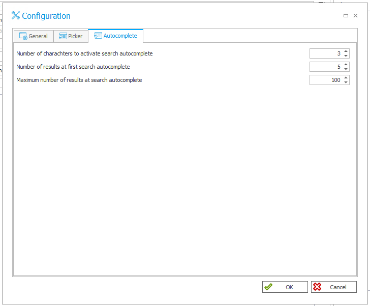
Fig. 8 Autocomplete tag in the autocomplete advanced configuration
The layout of the autocomplete field in the form is shown in Fig.9. Narrowed down results after filling in the adequate number of characters is presented in Fig.10.

Fig. 9 Autocomplete field in the form
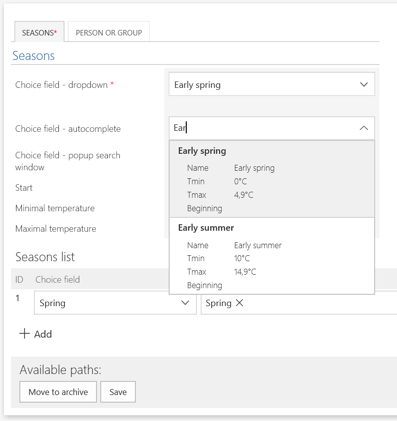
Fig.10 Autocomplete functionality of the Autocomplete field
Choice field with a search option
The configuration of the choice field with a search option differs from the configuration of the autocomplete field as the first option is not equipped with the “Autocomplete” tab, the other settings remain the same (Fig.11).
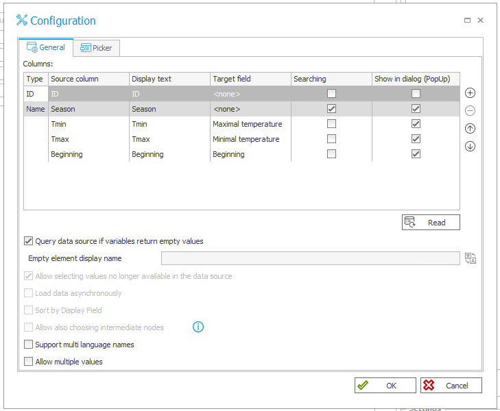
Fig. 11 Choice field with a search option – advanced configuration
When entering values into the choice field in the discussed mode, in most cases the choice field with a search option will open, as in Fig. 12. The choice field will not open when the exact value, designed to be selected, is entered or on the basis of a value entry the accurate value can be selected.
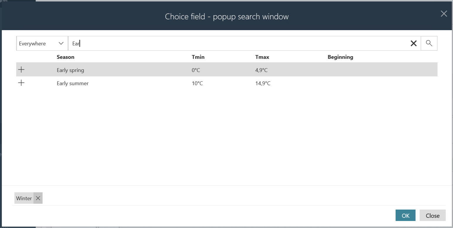
Fig. 12 Choice field with a search option
Person or group field
The person or group field operates as a separate form field, being de facto a choice field that uses the data source, that is, the organisational structure of a business entity (in most cases it is the Active Directory). The person or group field can be operated in two modes: choice field with a search option and autocomplete. These two modes work analogically to the option of an ordinary choice field.
In the advanced configuration of the person or group field (Fig.13), in the “General” tab, the source data column, data sources are downloaded automatically. As part of the configuration, as previously, one can define the values that should be displayed in the dialogue and the values that should be taken into account during a search.

Fig. 13 Advanced configuration of the person or group field in the choice field with a search option mode – General tab
In the “Picker” tab, one can additionally define the scope of the data originating from the organisational structure that should be available in the choice field; the number of people, domain groups as well as BPS groups can be reduced (Fig.14). By applying the “Sort only within the group” functionality the list of people available can be narrowed down to members of the selected group. For the advanced configuration of the person or group field in the autocomplete mode an additional tab for autocomplete settings is available.
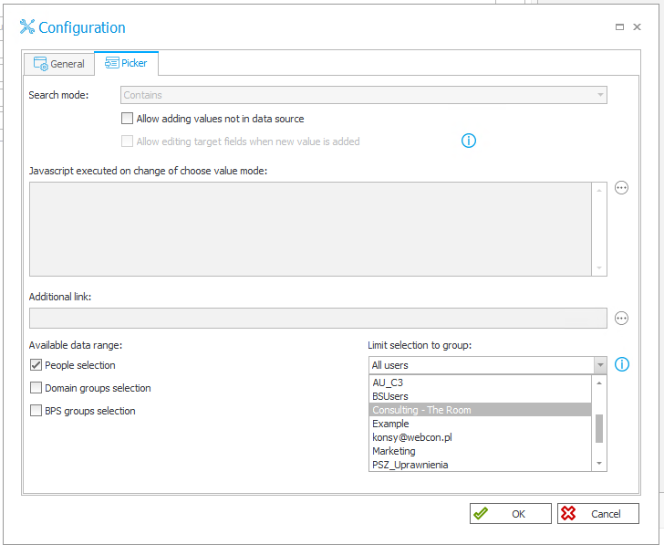
Fig. 14 Advanced configuration of the person or group field in the choice field with a search option mode – Picker tab
When the value entered into the person or group field occurs to be insufficient to identify clearly a given person, in the choice field with a search option a search field will be opened and in the autocomplete mode the list of values according to the inserted text and autocomplete configuration will be displayed (Fig.15).
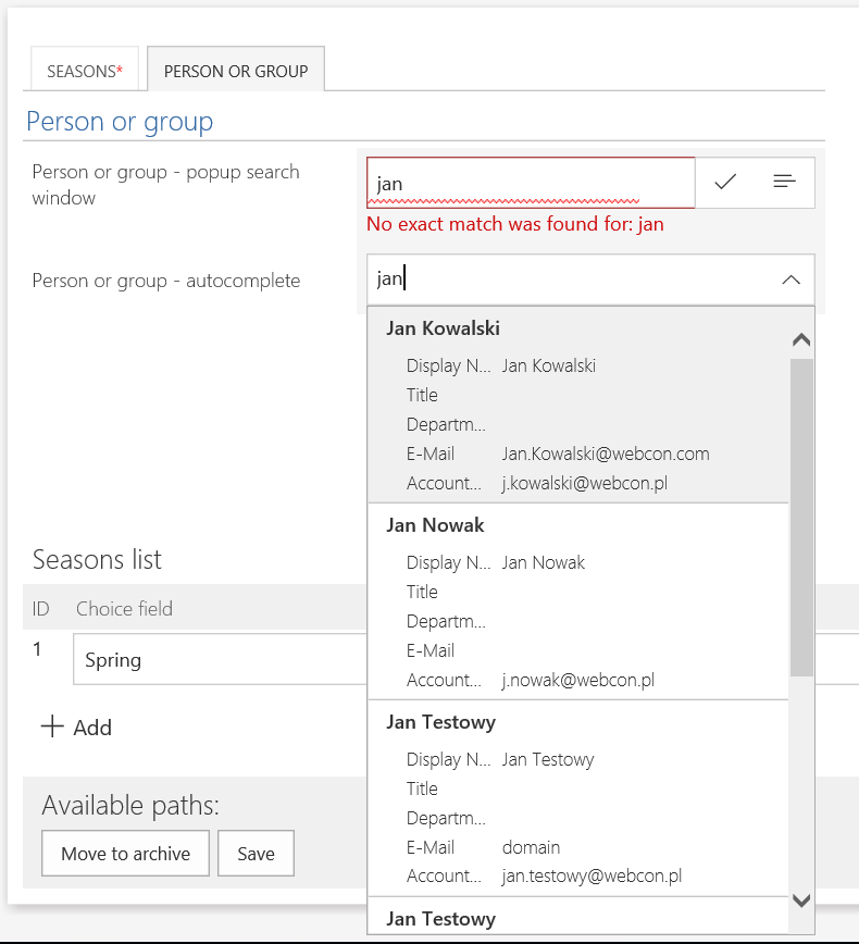
Fig.15 Person or group field in the form
Equally, the operating mode of the person or group field depends on the manner the information about the users is stored in the data source. As showned in the example above despite entering “Kowalski Jan” and the fact that “Jan Kowalski” is in the data source, the value has not been adjusted for both fields. It happens because the value enetred should be exactly the same as the one stored in the data source. It refers also the sequence: name and surname (Fig. 16). However, one can enter in the field, for example, only a surname or only a name then hints of the enetred value will be displayed.
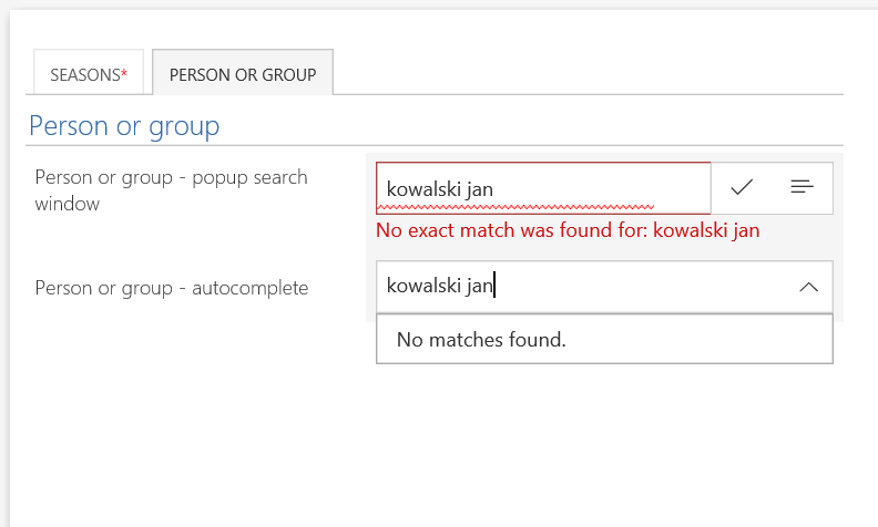
Fig. 16 Value entered should be exactly the same as the one stored in the data source, it refers also the sequence: name and surname
Choice column in the item list
In the item list choice columns refer to three modes of the choice field, according to the configuration, they are separate columns (Fig. 17).
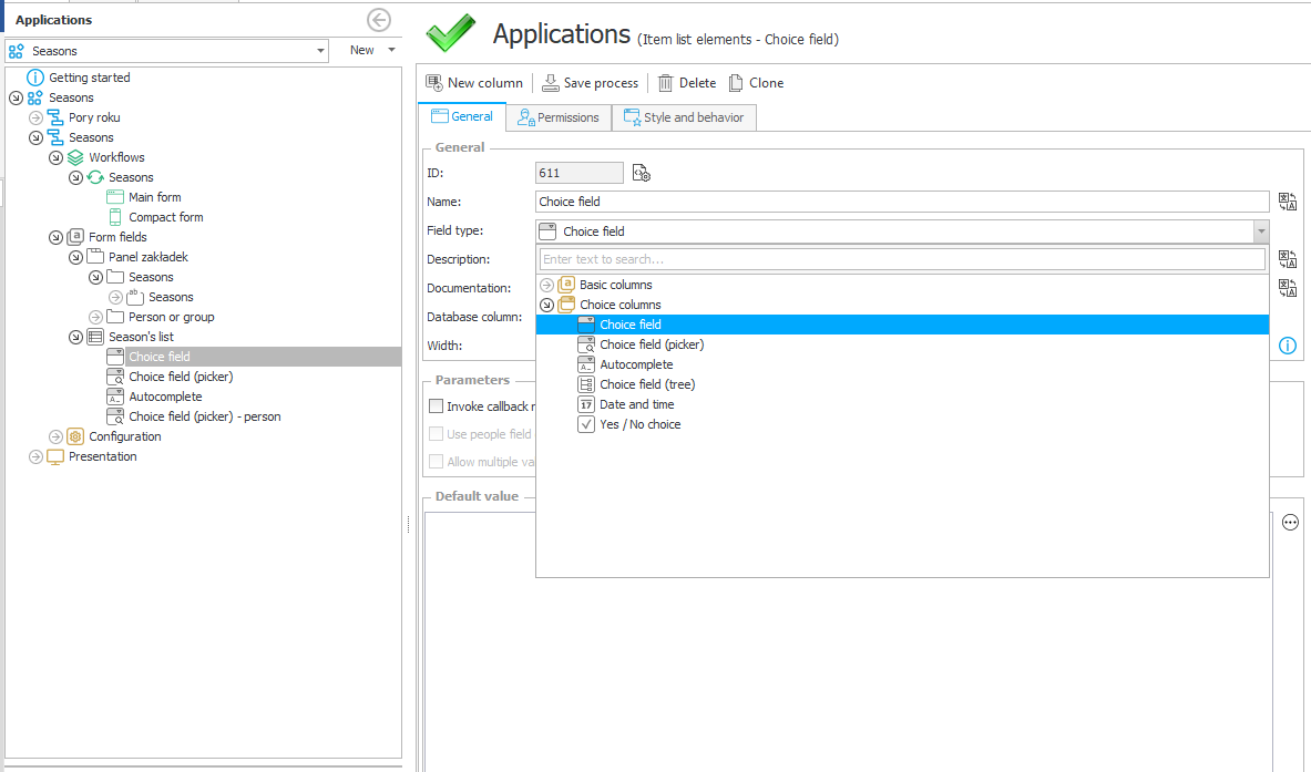
Fig. 17 Choice column in the item list
The function of choice columns is the same as choice fields outside the item list. In case of the item list there is no separate column analogical to the person or group field, therefore, in order to use the data source of the organisational structure one should mark “Use the data source of the person field” checkbox (Fig.18) in the form field parameters. The choice column layout is shown in Fig.19.
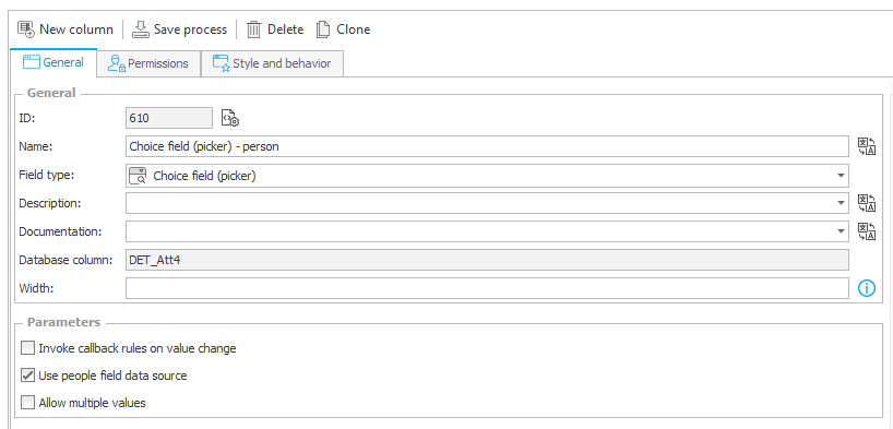
Fig. 18 Choice column with a search option, using the data source of the person field
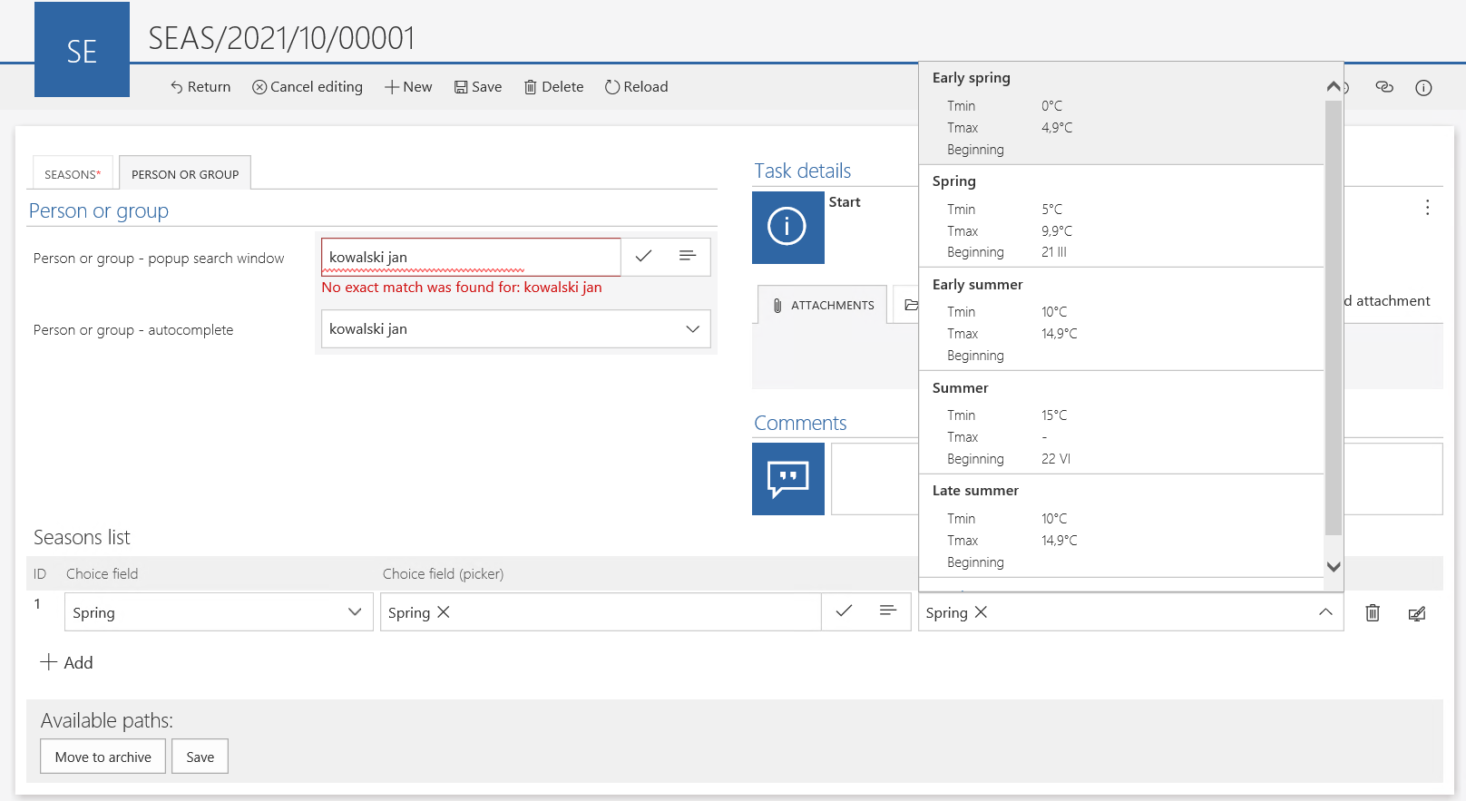
Fig. 19 Form with choice columns in the item list
To sum up
WEBCON BPS offers a vast array of functionalities of choice fields that fully satisfy the business logic within said respect.

