[external] Make Text-Based Groups Easier to Read and Recognize with a CONTROL STYLE-Based Outline
External content by Bjorn Poller, published on October 21st 2024;
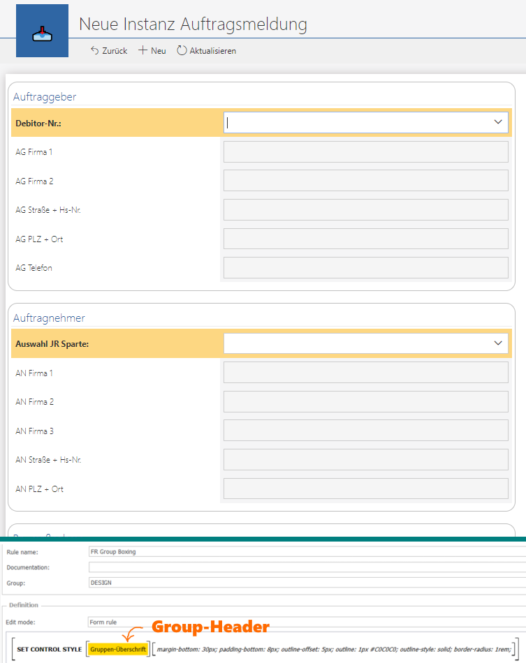
In one of our prototypes, we encountered issues with the number of text-based groups on the form. It became simply too cluttered, despite the use of groups. Using tabs for sorting would have been the least effective solutionin this case. After experimenting with CSS, we created a style parameter that we’d like to share. We’re happy with the design, and we hope some of you might find it useful as well.
The CONTROL STYLE parameters are as follows [tip: use a FORM RULE with parameter - see attached image]:
margin-bottom: 30px; padding-bottom: 8px; outline-offset: 5px; outline: 1px #C0C0C0 solid; border-radius: 1rem;
Here’s a brief description of the function of each style parameter:
-
margin-bottom: 30px;
Adds 30 pixels of space below the element, separating it from the content beneath it. -
padding-bottom: 8px;
Adds 8 pixels of inner spacing at the bottom of the element, creating more breathing room within the element itself. -
outline-offset: 5px;
Moves the outline 5 pixels away from the element's edge, providing a bit of visual separation between the element and its border. -
outline: 1px #C0C0C0 solid;
Creates a solid 1-pixel outline around the element in a light gray color (#C0C0C0), helping define the boundaries of the element. -
border-radius: 1rem;
Rounds the corners of the element by 1 rem (relative unit based on font size), giving it a smoother, more polished appearance.


