WEBCON BPS Designer Desk
Applies to version: 2021.1.x and above; author: Marek Suchowiejko
Introduction
Most applications supporting business process automation are created in IT departments. The key to success is the effective communication of requirements and expectations – the quality of the completed system depends on how well its specifications were communicated between the intended audience and designer.. Thanks to the effective cooperation of IT departments with business departments, it is possible to create a useful and intuitive application that meets all business requirements at the same time.
This article describes the concept of WEBCON BPS Designer Desk and presents how it can be operated to include business users in the design process. The example we use is a simple application for handling incoming correspondence.
Designer Desk
One of the new features introduced in WEBCON BPS 2021 is the Designer Desk tool, which enables the creation of application prototypes and expedites the process of collecting business requirements. The application prototyped in this way is then sent to the IT department for further refinement. Thanks to this, people without a technical background can create and test the operation of individual application elements (workflows, forms, dictionaries, reports).
Until the end of March 2021, Designer Desk will remain a free tool. With the publication of the WEBCON BPS 2021 R3, licensing in two variants will be introduced:
- For one user
- 10 license pack
When the free period of access expires – the unpublished projects will not be available until you purchase a license.
First steps
Administrator
To enable access to the Designer Desk tool, go to WEBCON BPS Designer Studio -> System settings -> Global parameters -> Designer Desk and check the “Allow project creation in Designer Desk” option. In the “Grant access to Designer Desk” field, indicate users who will be able to use this tool.
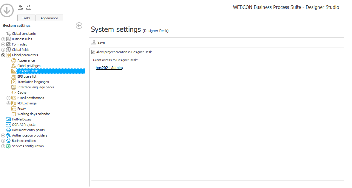
Fig. 1. The activation of Designer Desk
User
An authorized user will see a new option in the user’s menu on the Portal.
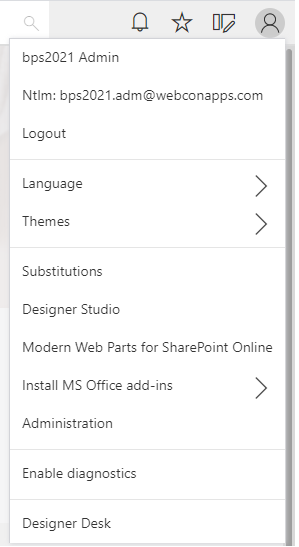
Fig. 2. The user’s menu
The tool is also available at the direct link: {portal address}/designer.
Creating a project
To create a new project, click “New project”, name it, and select the appropriate database (if there is more than one database).
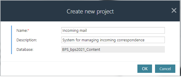
Fig. 3. Creating a new project
Each created project receives a dedicated page with the following elements:

Fig. 4. The main page of the project in Designer Desk
- Project name and description – basic information about the project
- Form designer – creating the form
- Workflow designer – creating the workflow
- Starts – creating start buttons
- Reports –creating reports
On the left, there are links to data sources and reports (if previously created), and the Add new” button which enables:
- Defining reports
- Creating dictionary lists
Buttons in the top menu allow you to work on the current project:
- Save – save the project.
- Publish – irreversibly migrate/transfer all configuration from Designer Desk to Designer Studio. After publishing, you can modify the process only from Designer Studio level.
- Remove test documents – remove test documents created during the design phase
- Remove project – remove the entire project
Creating elements
When designing an application, it is important to define and describe the business requirements for each element.
Workflow designer
Start designing your application by creating the workflow and individual steps. The workflow designer is available from the project main page or the menu (Workflow -> Designer).
On the left, there are two tabs:
- Steps – the stages of the workflow
- Actions – events executed when documents travel between steps of the workflow e.g. validation of entered data, file generation, sending notifications. You can define additional conditions for each action.
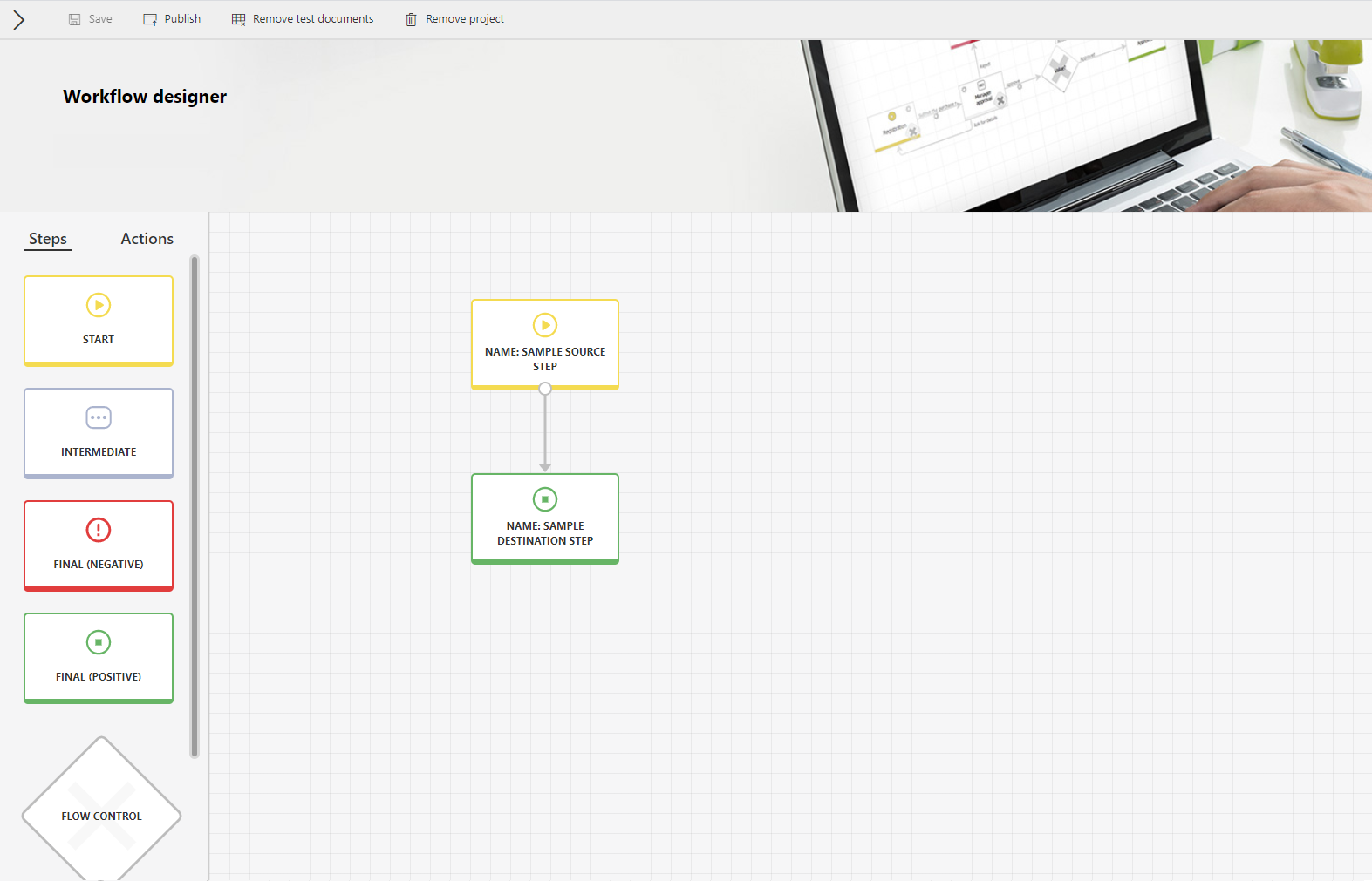
Fig. 5. Workflow designer
Each created project contains two default steps – Start and Final which are connected by one path. You can add any number of intermediate steps, define flow control steps (they are used for directing documents through one of the possible paths based on a condition e.g. can be used to skip a step if some condition is met), and system steps (the are used when it is necessary to wait for external actions, e.g. synchronize data between systems, attach a scan, and complete a sub-workflow).
You can freely drag elements from the left panel to the editing area. To connect two steps in the diagram, hover your mouse cursor over any step and connect the dots.
After adding an action on the selected path, an additional icon will appear next to it. You can define the order in which actions will be executed (if there is more than one action), and edit or delete the action.
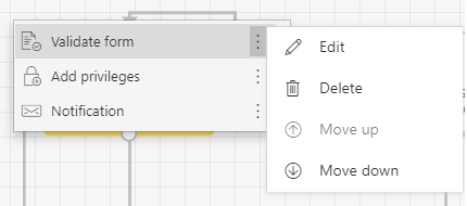
Fig. 6. Available actions on the transition path
When you click on any diagram element, a window with its properties will appear on the right side.
- Steps – you can only change the name and description
- Paths – you can define additional visibility restrictions and assign a task to the specified user
- Actions – you can change the action type and define additional execution conditions
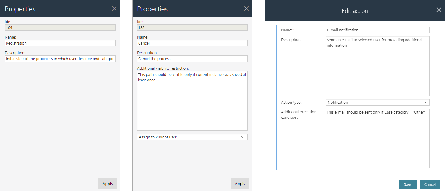
Fig. 7. Step/path/action edition
You can zoom in/out on the diagram. To move the selected step with paths – just click on it, hold and move. By holding the cursor anywhere else, the entire diagram will be moved.
Sample diagram:
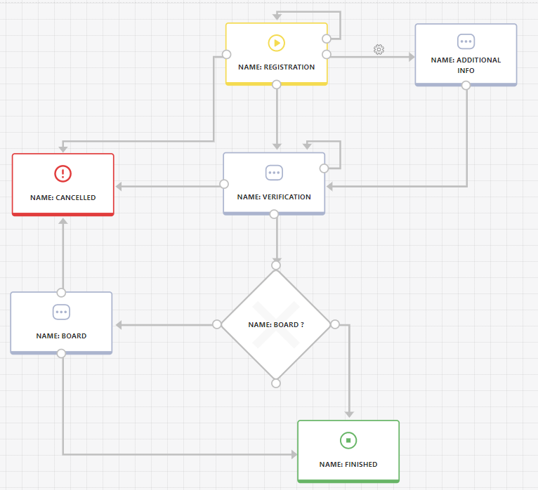
Fig. 8. Sample workflow diagram
Form designer
The form designer is available directly from the project main page or the menu (Form -> Designer). The form fields available for creating the form are on the left side. Individual fields can be placed in one of the four sections on the diagram.
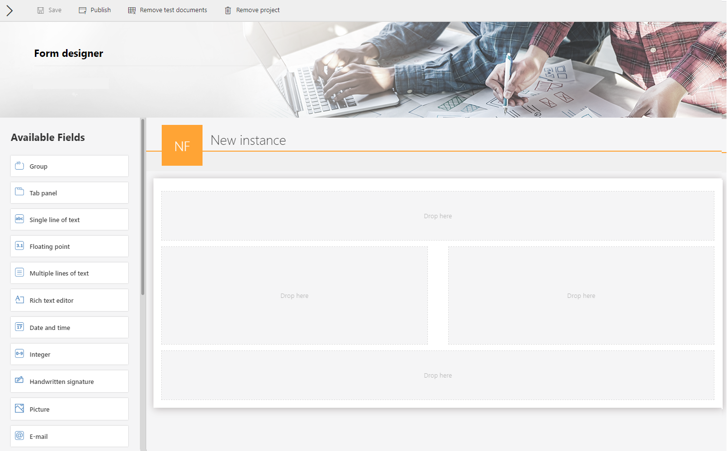
Fig. 9. The form designer
To make the form easier to read, the form fields (e.g. text fields, choice fields, dates) should be grouped or placed in tabs. After dragging the form field to the form area and hovering over it, you will see available options: edit, move and delete.
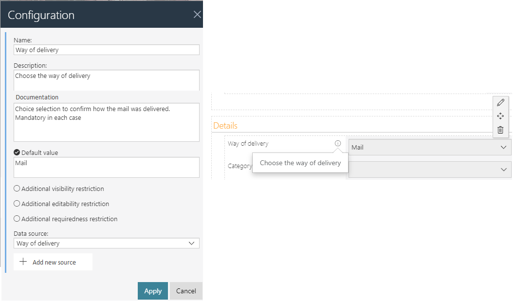
Fig. 10. Form field configuration
There are several options in the form field configuration:
- Description – a description that will appear in the tooltip for a user. It should be short, understandable, and contain useful tips.
- Documentation – a detailed description of individual form fields operation. This description will be transferred to the documentation that can be later generated from Designer Studio.
The remaining fields should be filled in depending on the business scenario:
- Default value – a specific value or a rule on how to determine it, e.g. “Amount = 1000”.
- Additional visibility/editability/requiredness restrictions – select this option if the form field is to be visible only for selected users or in special cases.
At the project stage, it is not important how each rule will be technically implemented, but the precise definition of the boundary conditions is very important. They should be described so that people who implement the system have no doubts during implementation.
Dictionaries
For dictionary fields (Dropdown, Popup search window, Autocomplete, Choice tree) you must define the data source i.e. set of dictionary values. For each of these form fields, indicate an existing source or create a new one:
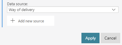
Fig. 11. Adding a data source
Data sources can be defined independently and used when designing the form, or they can be created on an ongoing basis when editing individual dictionary fields. Designer Desk allows you to enter only static values. For the dictionaries to work properly, it is necessary to provide an ID and a Name for each dictionary value. After filling in the Name and Description, add the records in the editor, which will be available in the dictionary.

Fig. 12. The configuration of data source
An example form of incoming correspondence may look like this:
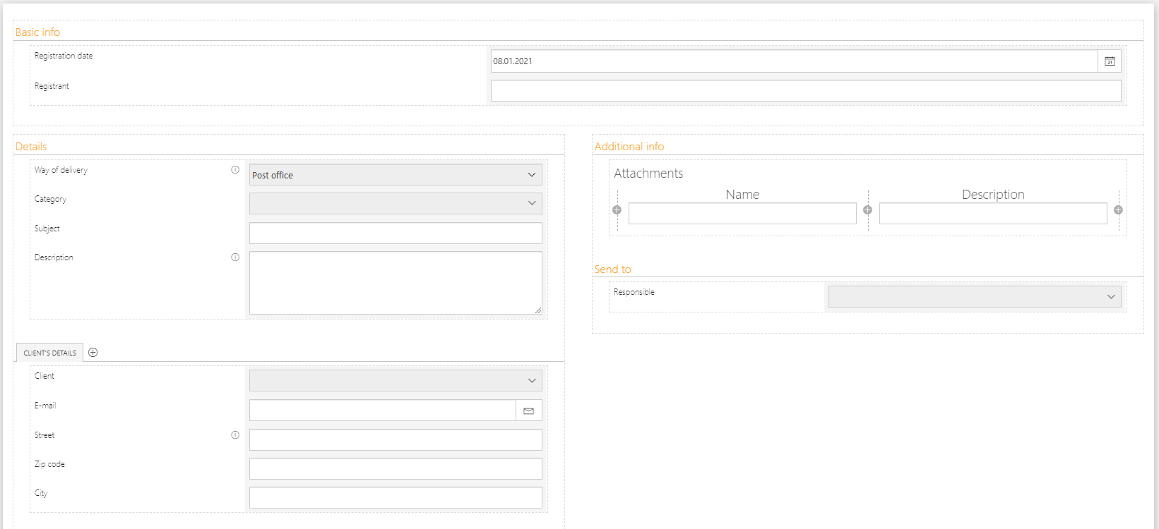
Fig. 13. The incoming correspondence form
Field matrix
After defining the form and workflow designer, complete the field matrix and define the visibility/editability/requiredness for each field in the individual steps. The matrix consists of four sections where you can place form fields according to the global form template – top panel, left panel, right panel, and bottom panel.
The legend of the field matrix is on the bottom bar of the tab:
- Blue square – visibility of the form field
- Green square – editability of the form field
- Red square – requiredness of the form field
Remember that the settings of groups and tabs have priority over the settings of form fields, i.e. if only one field was editable in a given section, then the group /tab where it is located must also remain editable.
Starts
To test the designed application, create a start button - to do this, select Starts -> Add new. Enter the name of the button and define additional parameters (optional). At any time, you can return to the created workflow, make changes and test the operation again.
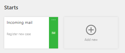
Fig. 14. Start button
Reports
After creating the workflow, form, and field matrix, you can focus on designing reports – thanks to which users can view documents created in the system. To add a new report, select Reports - > Add new -> Table report.
For more information, see Reports - configuration, views, editing.
Project publication
If your project is ready, you can publish it – click “Publish” in the top menu and confirm publication by clicking “Yes”. The operation is irreversible and further changes will be possible only through Designer Studio.
You can also decide if the test elements will be deleted.
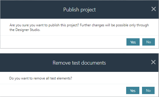
Fig. 15. Publication the project, removing the project
There are two statuses for projects in Designer Desk:
- Prototype phase – all project elements (workflow, form, field matrix, reports) are editable.
- Design phase– the project can only be edited in Designer Studio.
The status of each project is visible on the Designer Desk main page.
Project development in Designer Studio
Published projects are located in Designer Studio in the “Designer Desk projects” group. All defined and described elements are automatically created and saved in the appropriate places with the initial configuration.
Important information:
Action conditions
Additional conditions for action execution are saved as business rules related to a specific action. The “Documentation” field will contain a description from Designer Desk. The definition of the rule is always the Boolean 'POSITIVE' value - it should be changed to the target value under the provided requirements.
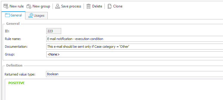
Fig. 16. Conditions for action execution
Visibility/editability/requiredness restrictions
Additional restrictions are saved as business rules related to specific form fields. The “Documentation” field will contain a description from Designer Desk. The definition of the rule is always the logical 'POSITIVE' value - it should be changed to the target value under the provided requirements.
Default values
Default values are saved as business rules related to specific form fields. The “Documentation” field will contain a description from Designer Desk. The definition of the rule is always the 'EMPTY' value - it should be changed to the target value under the provided requirements.
Dictionaries
Dictionaries are saved as a fixed list of values related to specific choice fields. The “Documentation” field will contain a description from Designer Desk, and the entered dictionary values correspond to the defined records. Make sure to configure target connections and queries that will return the correct data as described.
Summary
WEBCON BPS Designer Desk is a new tool designed to support the process of collecting business requirements and prototyping applications. The main purpose of this tool is to expand the group of people who are involved in the design process, gathering feedback and ideas to produce a working application concept that can then be presented and consulted with other departments.

