Charts in WEBCON BPS
Applies to version: 2021.1.x and above; author: Konrad Wojtycza
Introduction
Thanks to the Chart type form field, you can graphically present data on the form simply and legibly. When you work with a large amount of data, it will be easier to present it in a visual form – it will significantly reduce the time spent on analyzing information. The article presents the configuration and method of data presentation.
For the purposes of the article, a workflow including an employee satisfaction survey has been created. The data obtained from this workflow will be presented in a bar chart – the chart is dynamic. Additionally, static charts based on data entered into the database will be presented.
Configuration
The Chart form field can be found in the Data presentation section on the form fields list. The configuration requires:
- Preparing a data source, most often in a table of an appropriate form (Fig. 1)
- Defining additional settings in the advanced configuration window
The basic table for the Chart form field must have at least one column that acts as a numeric data series.
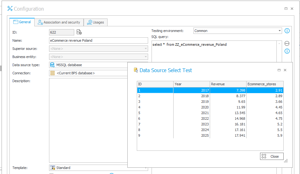
Fig. 1. “E-commerce revenue Poland” data source
The advanced configuration
Data - the table displays all the columns returned by the data source. It is possible to define the display names and their translations. You can also select which column should be marked as a data series.
Options:
- Chart type - select one of the available charts: Line, Bar, Pie, Donut
- Label column - column of values which will make up the category (horizontal) axis for line and bar charts. For pie and donut charts, these will be the names of individual chart sectors
- Chart title - enter the chart title, it is possible to define translations
- X axis label - available for bar and line charts, it is a description of the X axis, you can also define translations
- Y axis label - available for bar and line charts, it is a description of the Y axis, you can also define translations
- Chart color - the color scheme of the chart, can be set to match either the main or background theme of the form, or it can be set manually. For line and bar charts, it is possible to set individual colors for each series, selecting the last option (“Use data series color”) will add another column to the “Data” table where custom colors can be set
- Chart height (px) - you can adjust the height of the displayed graph, given in pixels
- Display mode of chart labels - available for bar and line charts, it allows you to select the way to display labels describing the X axis: horizontally or angled
Show form field name - it allows you to decide whether the form field name should be displayed above the chart
Line and bar charts
The advanced configuration of a simple bar chart with two data series is presented in Fig. 2.
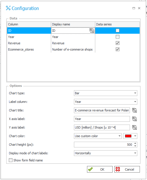
Fig. 2. The advanced configuration of the Chart form field
The data source used (Fig. 1) describes the revenue of the E-commerce industry in Poland (in billions of dollars), as well as the number of online stores (in tens of thousands – 10^4) registered in Poland in subsequent years. The data after 2021 is forecast data.
The visible charts are interactive, it is possible to choose the presentation of the selected data source. In the case of the bar chart, it is also possible to select the display mode in the form of a grouped chart (Fig. 3) or stacked chart (Fig. 4).

Fig. 3. Bar chart – grouped
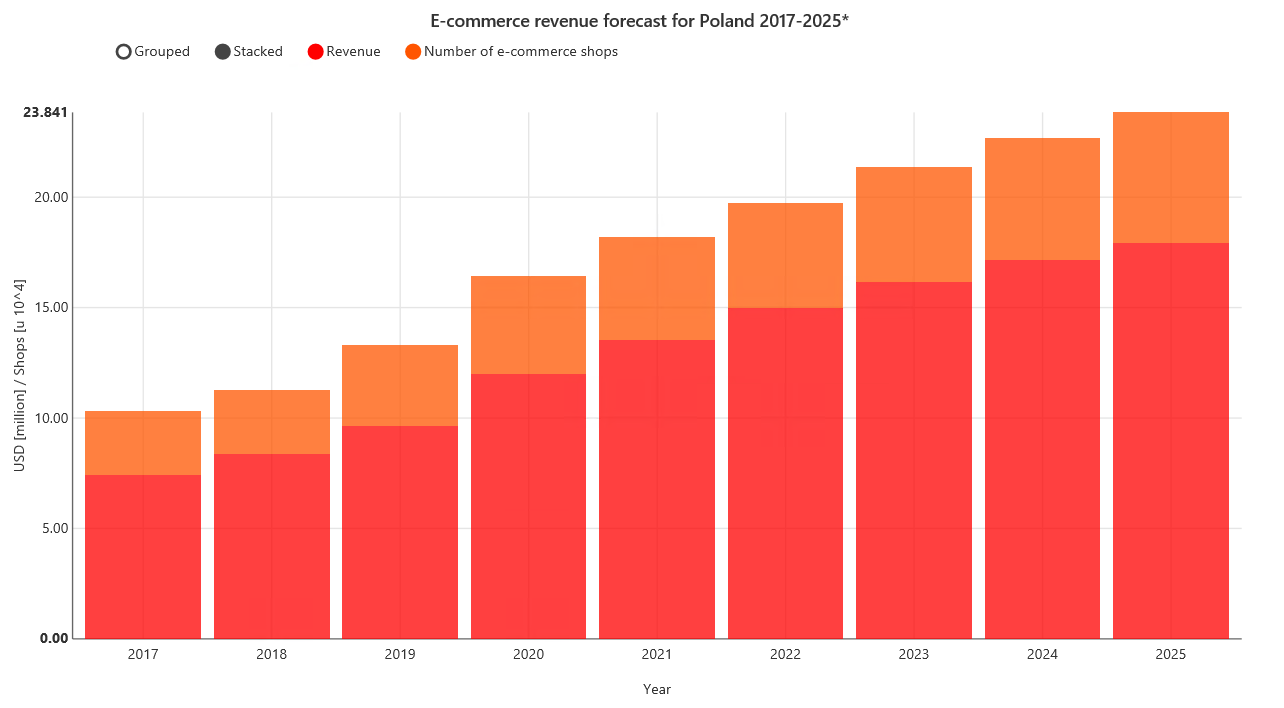
Fig. 4. Bar chart – stacked
The Line chart showing the same data is presented in Fig. 5. The configuration used for this chart differs from the configuration in Fig. 2 in the type and color of the chart.

Fig. 5. Line chart
Multi-series bar chart
It is possible to create more complex multi-series charts, such as a chart showing the results of an employee satisfaction survey divided into company departments (Fig. 6).
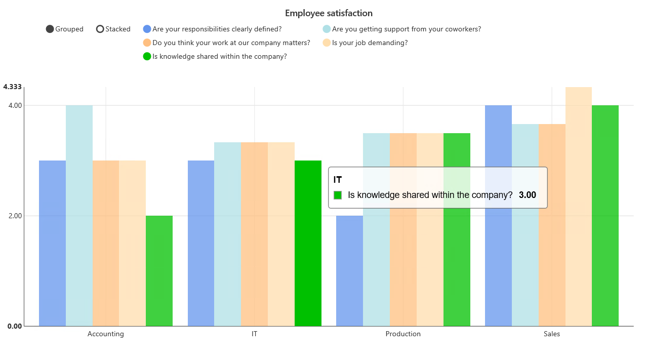
Fig. 6. Multi-series bar chart
The basis for creating such a chart is a properly prepared data source. The source presented in Fig. 7 shows the average of the answers on a scale of 1-5 for the next questions from the employee satisfaction survey, grouped by the company’s department participating in the survey. As before, it is possible to present the chart without selected data series, in stacked or grouped chart mode.
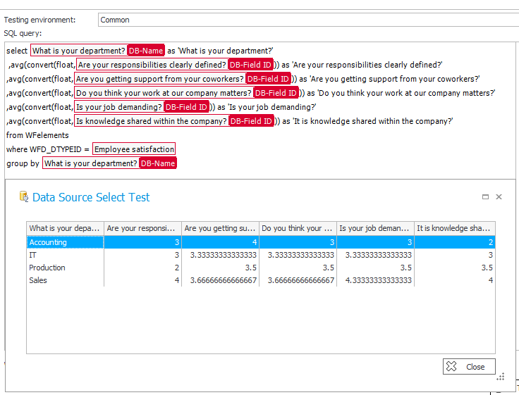
Fig. 7. The configured data source
According to the form field configuration, data series are all questions asked in the survey. The column of labels is the “What is your department?” column which allows you to group the results by company departments. The color of the chart is determined based on the colors indicated by the data series.
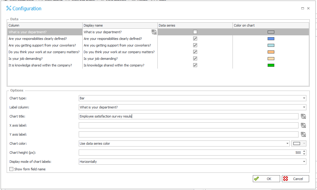
Fig. 8. The advanced configuration of the multi-series chart
Pie and donut charts
In the case of the presented pie and donut charts, the data source is a table presenting the preferred online payment methods in Poland. The market share of a given payment is presented as a number, while in the chart these values will be automatically treated as a percentage. The data source used in the presented example is shown in Fig. 9.

Fig. 9. Data sources for
The configuration of the pie chart is visible in Fig. 10. In the data source used, two columns with data labels are visible:
- the “Payment method” column containing payment methods
- the “Payment method PL” column with corresponding translations into Polish

Fig. 10. The configuration of the pie chart
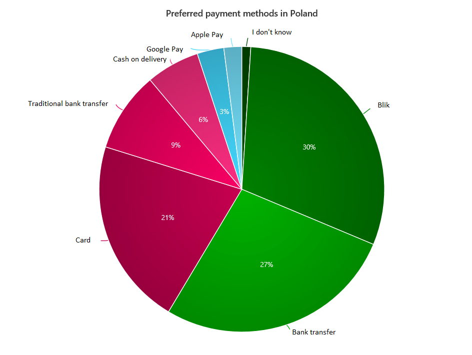
Fig. 11. Pie chart
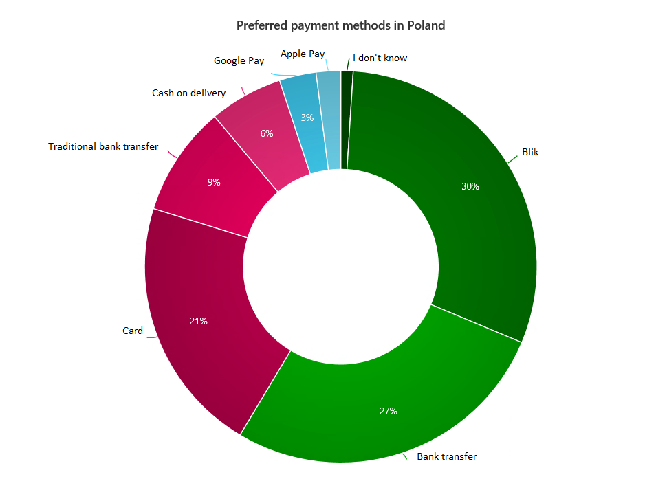
Fig. 12. Donut chart

